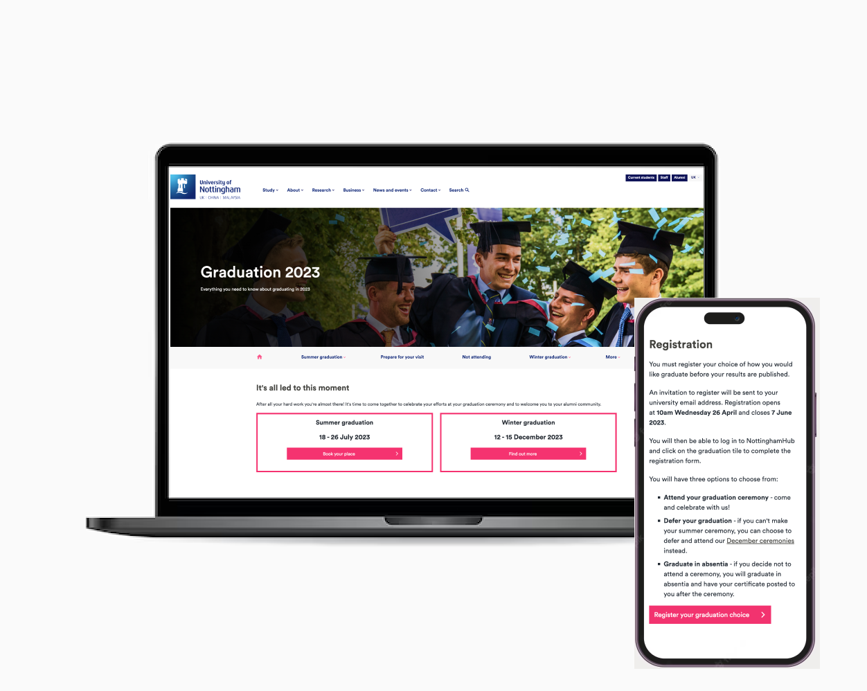
Graduation at University of Nottingham
Delivering improvements to the navigation and user journey for Graduation 2023 pages.
Client: Marketing team at University of Nottingham
Role: I was the co UX/UI Designer on an Agile team comprising of 2 developers and 3 product owners. I was responsible for determining the overall design direction of the project, while collaborating with the rest of the team for project management
If you are in a hurry, view the whole journey here
Problem Statement
The marketing team were keen to improve the navigation issues of the Graduation webpages for Summer
graduation 2023.
Some of the main issues included lack of breadcrumbs and a secondary navigation bar that can help
users navigate across
large amounts of information and find what they are searching for.
Students complained that it was hard to find the graduation guide, information relating to gowns and
clearing, clear ceremony schedules and school dinners.
There were also complaints about lack of 'a human element' on the website in terms of video and
photo content.
The main questions we want answers to are:
- Are the concerns of the marketing team valid?
- What information are different user groups trying to find?
- Were all the answers available from the website?
- Did students feel supported throughout their entire graduation journey from booking tickets to the end of the day?
Research
Goals
Below are the areas I'd like to explore during user research.I want to understand:
- What are the key bits of information users want to get out of the website?
- The pattern of finding the information
- The detail and depth of information the uses are looking for
Methodologies
- Interaction and traffic prone areas from heatmaps
- 1-1 semi structured interviews with students who have recently graduated
- Survey responses from students who have recently graduated
Data insights
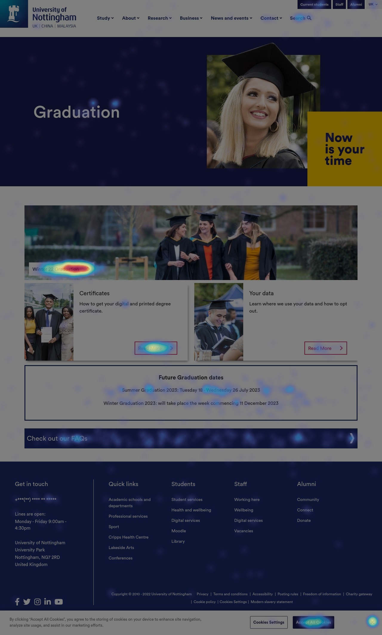
Graduation homepage
- The hero banner is very big which means that no information is available above the fold in the first glance.
- Winter'22 graduation receives most of the clicks on the page, however the button does feel lost in the image.
- There seems to be very low interaction with "Your data", which implies users are not interacting with this and it does need to be put on the main landing page.
- The future graduation dates box is only visible after some scroll.
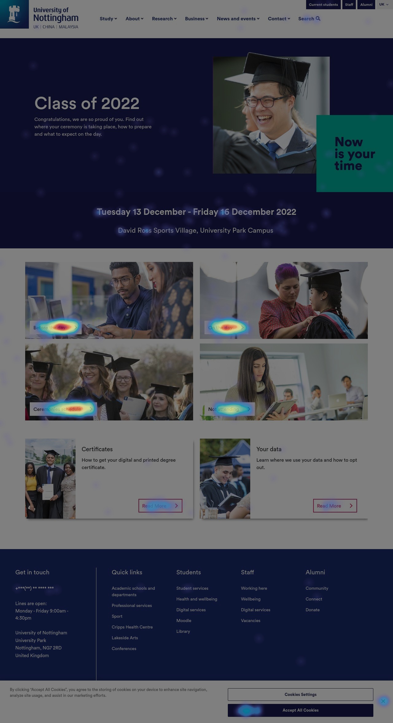
Graduation season page
- The hero banner is very big, however the dates are very clear.
- All 4 component cards have a very high interaction rate.
- There is a repitition of "Certificates" and "Your data" component cards on this page which do not have a high interaction rate.
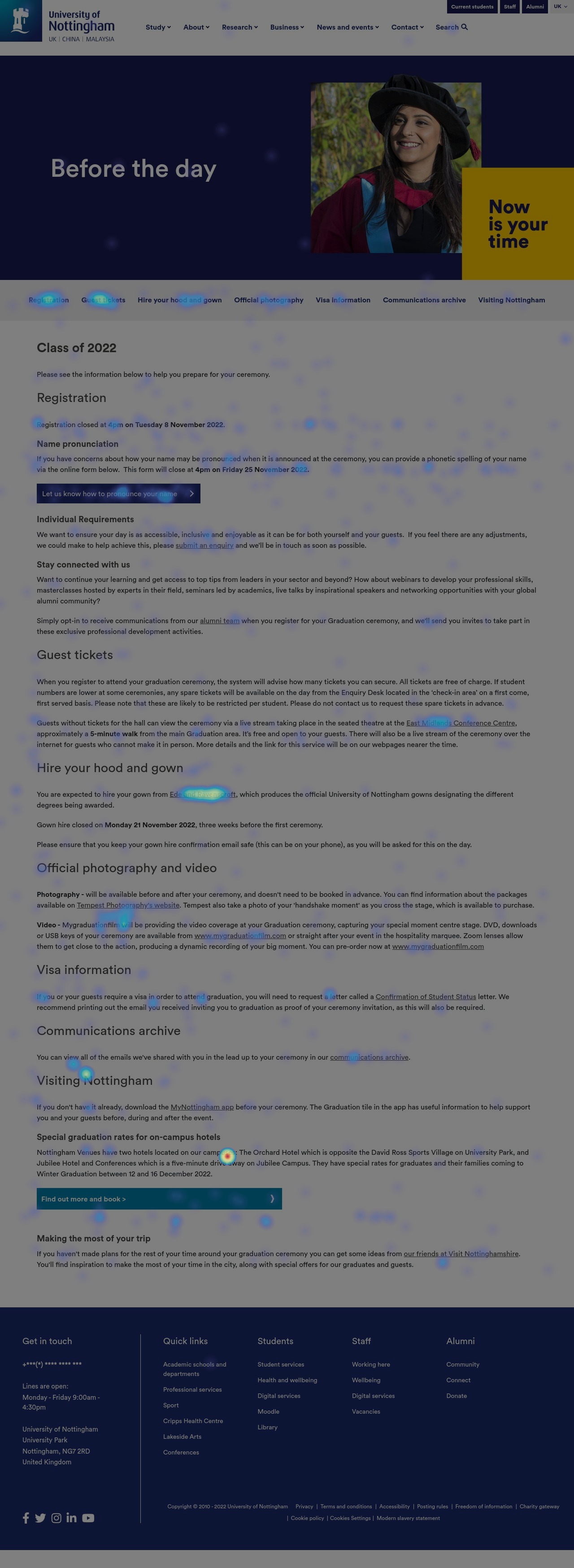
Before the day
- The hero banner is very big
- The secondary nav bar only acts as anchor links to the content on the page
- The interaction decreases further down the page which implies that users are not reading all this content.
- Very high interaction with some quick links indicting that these can be pulled out into CTAs.
- We can have more engaging copy for buttons for example, "Find out more and book" can be changed to "Join the graduation celebration - Book Now!"
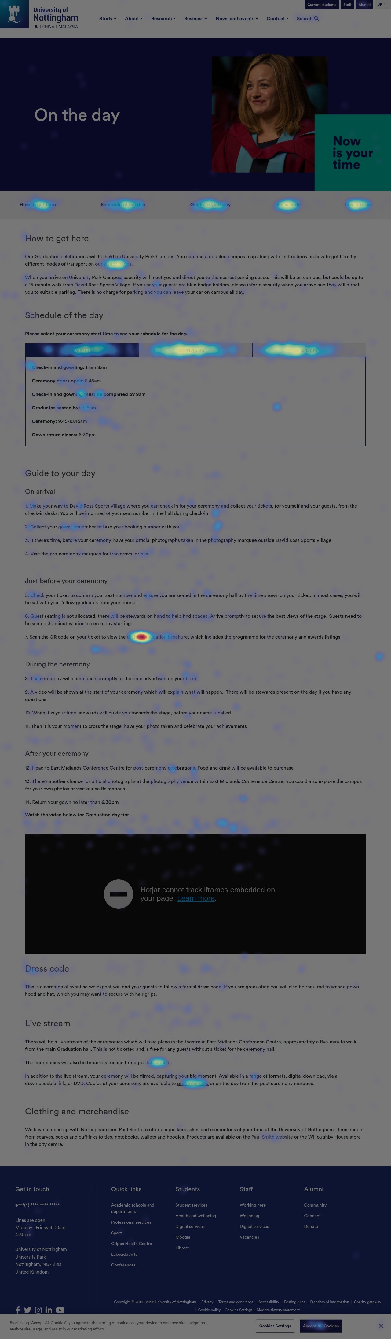
On the day
- The hero banner is very big
- The secondary nav bar only acts as anchor links to the content on the page
- The ceremony schedule is hidden behind tabs which is a crucial element for graduation. Is there a possibility for users to miss this?
- The interaction decreases further down the page which implies that users are not reading all this content.
- Very high interaction with some quick links indicting that these can be pulled out into CTAs ex graduation brochure
- Is this amount of information on the page enough for each heading?
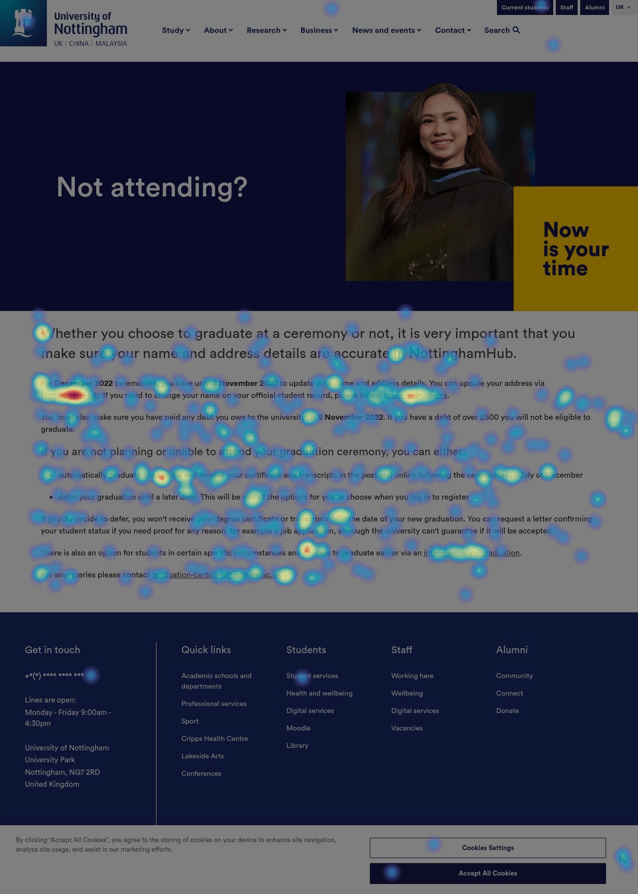
Not attending
- The hero banner is very big
- High interaction with graduating in absentia; can more context be added here about the same?
- Very high interaction with some quick links indicting that these can be pulled out.
Competitor research
| University | What they do well? | What can they improve? | How can UoN adapt? |
|---|---|---|---|
| University of Leeds |
|
|
|
| University of Sheffield |
|
|
|
| University of Birmingham |
|
|
|
Nottingham Trent University |
|
|
|
| University of East Anglia |
|
|
|
Interviews
The interview questions were created based on the requirements and assumptions of the marketing team to uncover the frustrations the users were having with the website. The interview questions can be accessed from this document: Click here
Research synopsis
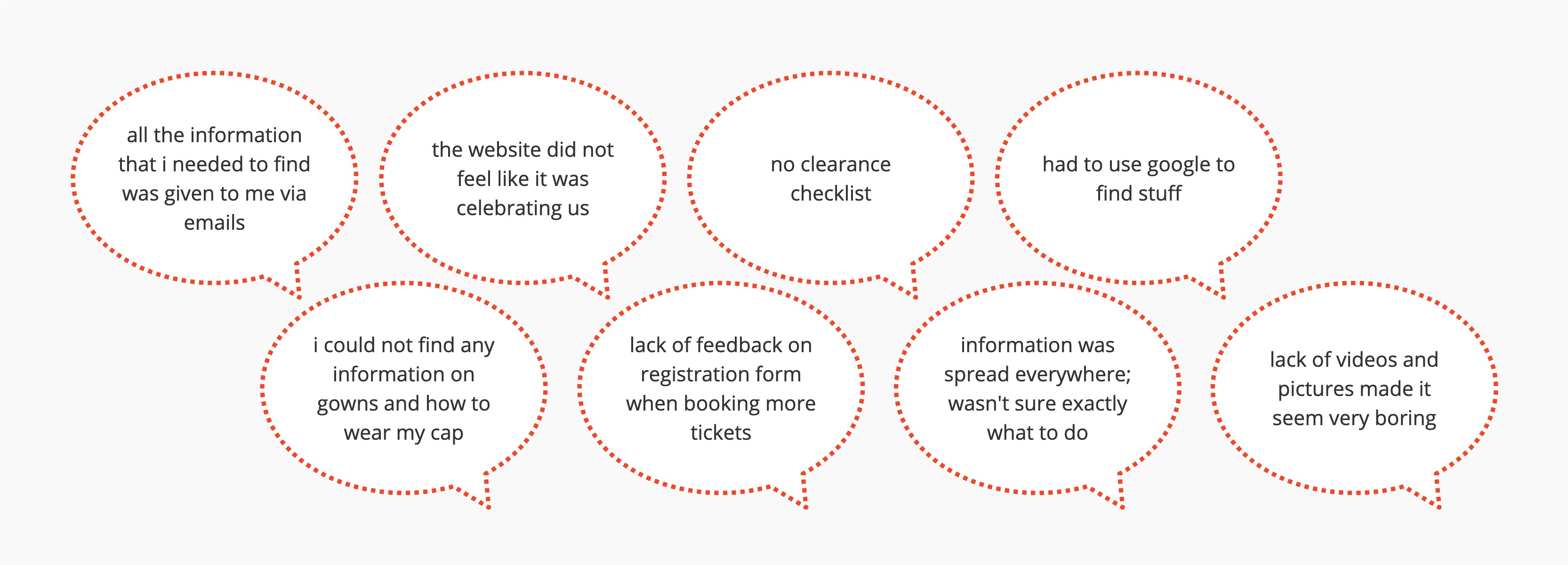
- Most of the participants complained about the lack of information on the web pages and showcased frustration on being dependent on emails. Since emails do tend to get lost in the inbox.
- A lot of students also complained that there wasn't a section for parents such as about the city of Nottingham and where to stay etc which highlighted the fact that parents are also a crucial user group that we need to consider while building personas.
This proves that...
The insights gained from user feedback during the research phase have provided valuable direction for the redesign of the University of Nottingham's graduation website. The feedback indicates that there is a need to improve the user experience by addressing issues such as difficulty in finding information and navigating the site. By addressing these concerns, we can minimize frustration for users and provide a more efficient and effective platform for accessing graduation-related information.Survey
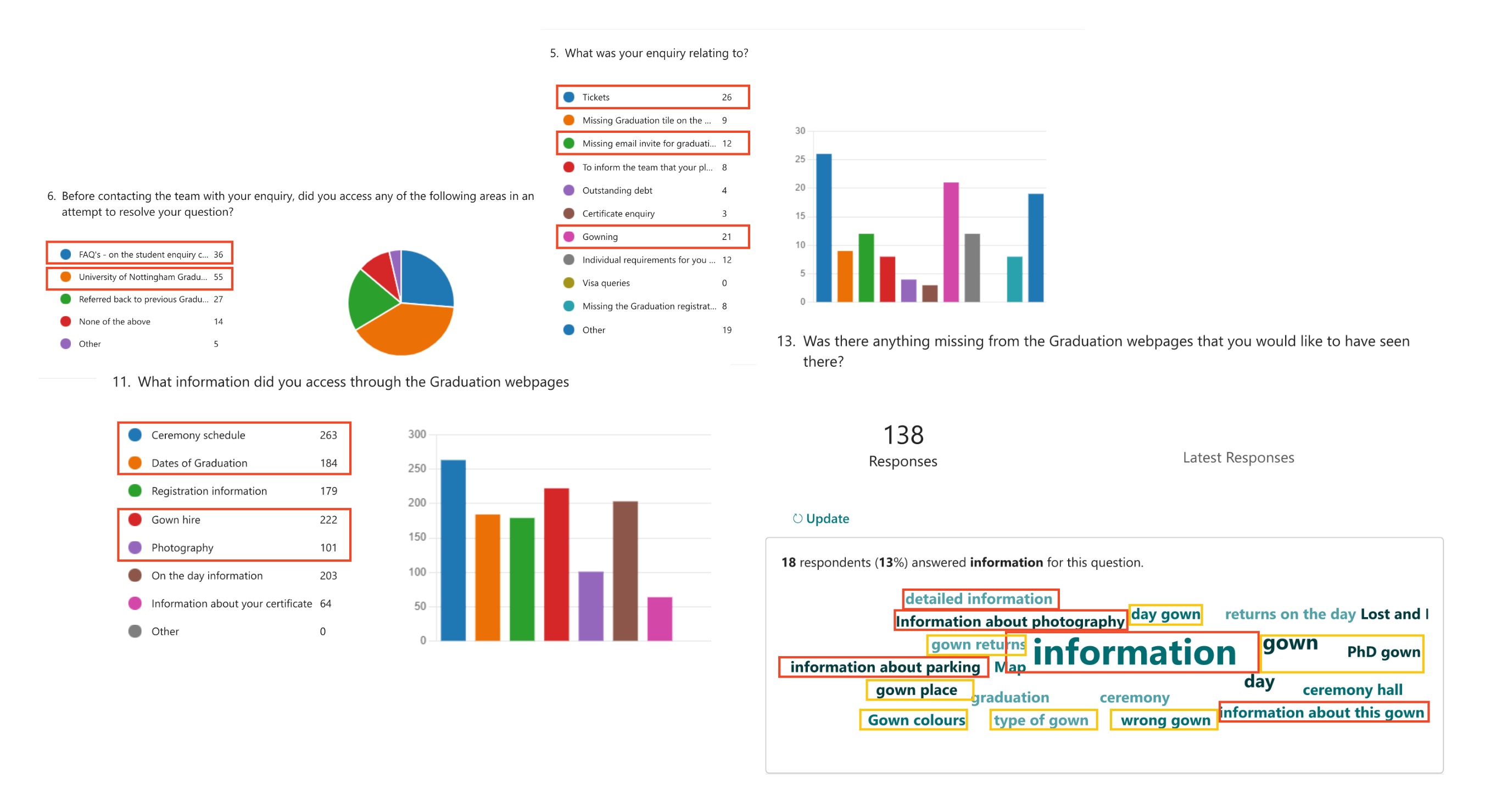
The survey was sent by the Marketing team to the students who graduated in the Winter 2022 season. A total of 341 responses were received. Some of the key stand out points from the survey include:
Key takeaways
- Finding "information" of any kind was a difficult task whether that was related to the schedule for the day,parking, location etc
- Gowns was a big thing people have complained about which can also sit under "Unavailable information"
- Students opted to refer back to emails rather than checking the website for any kind of information they wanted to find
Define
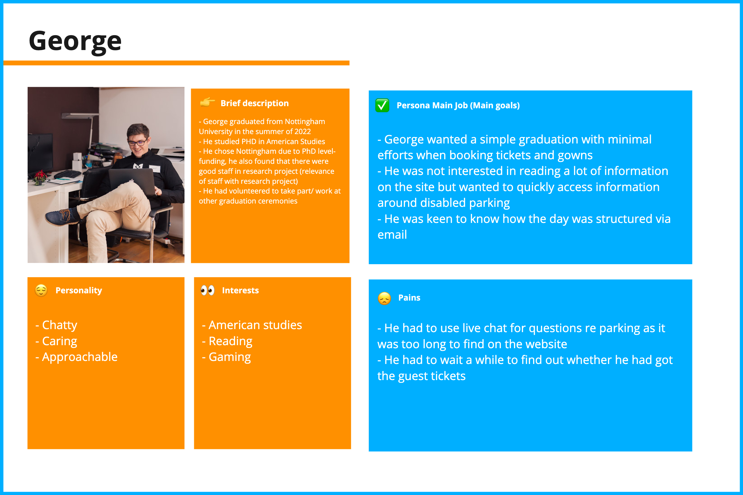
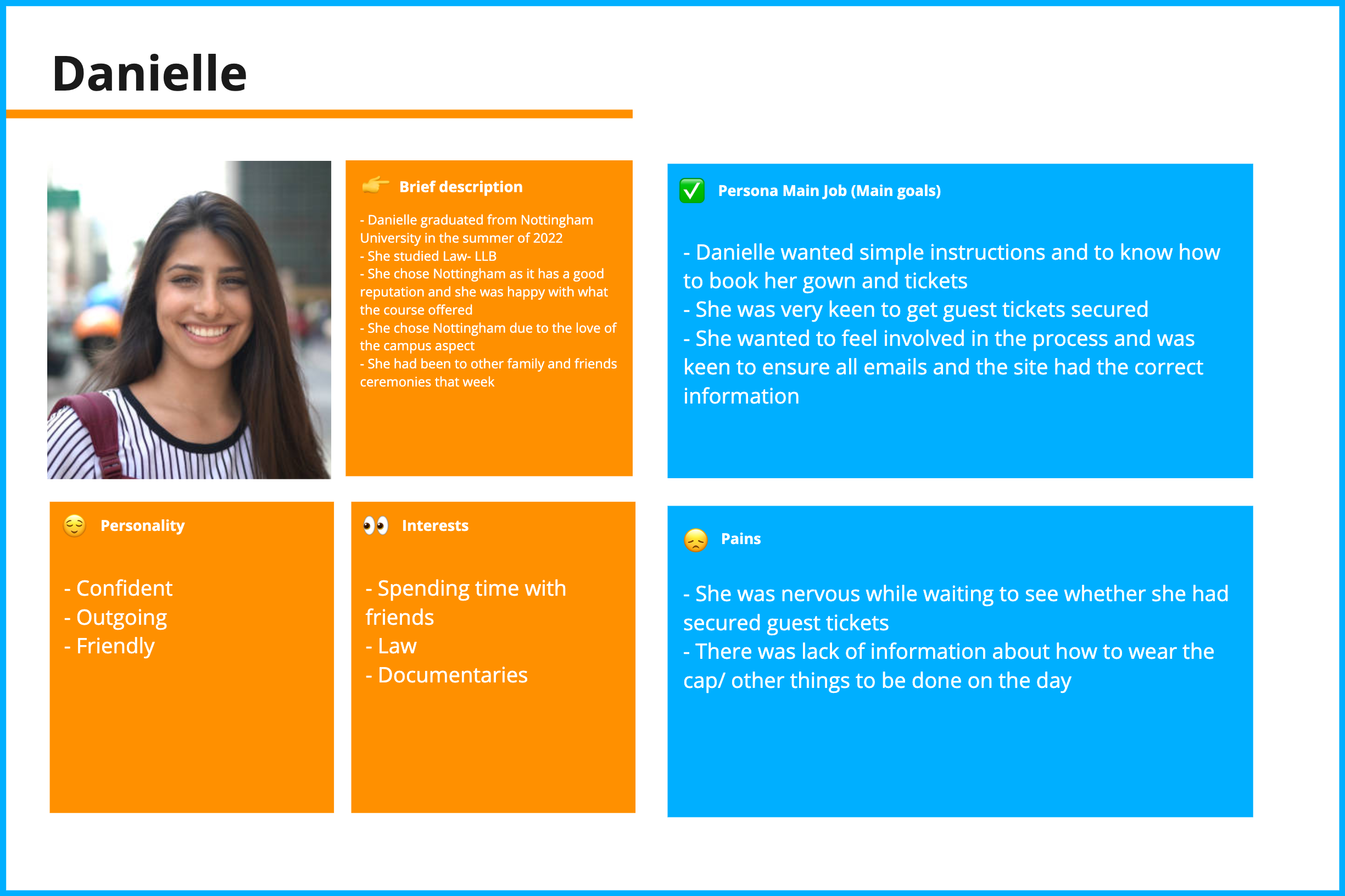
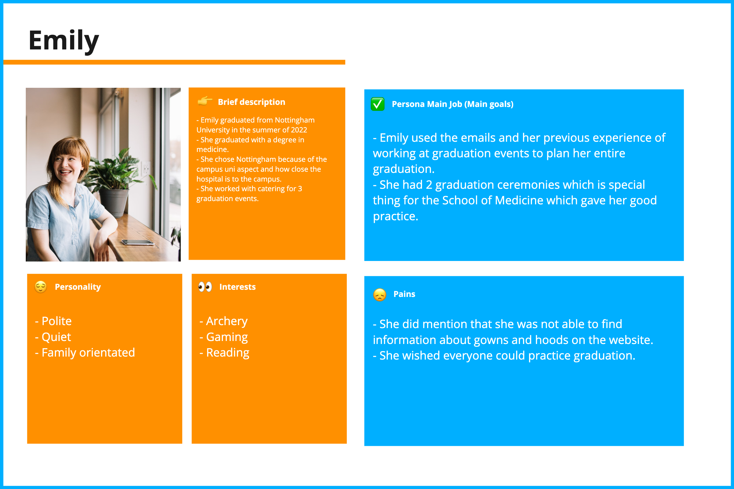
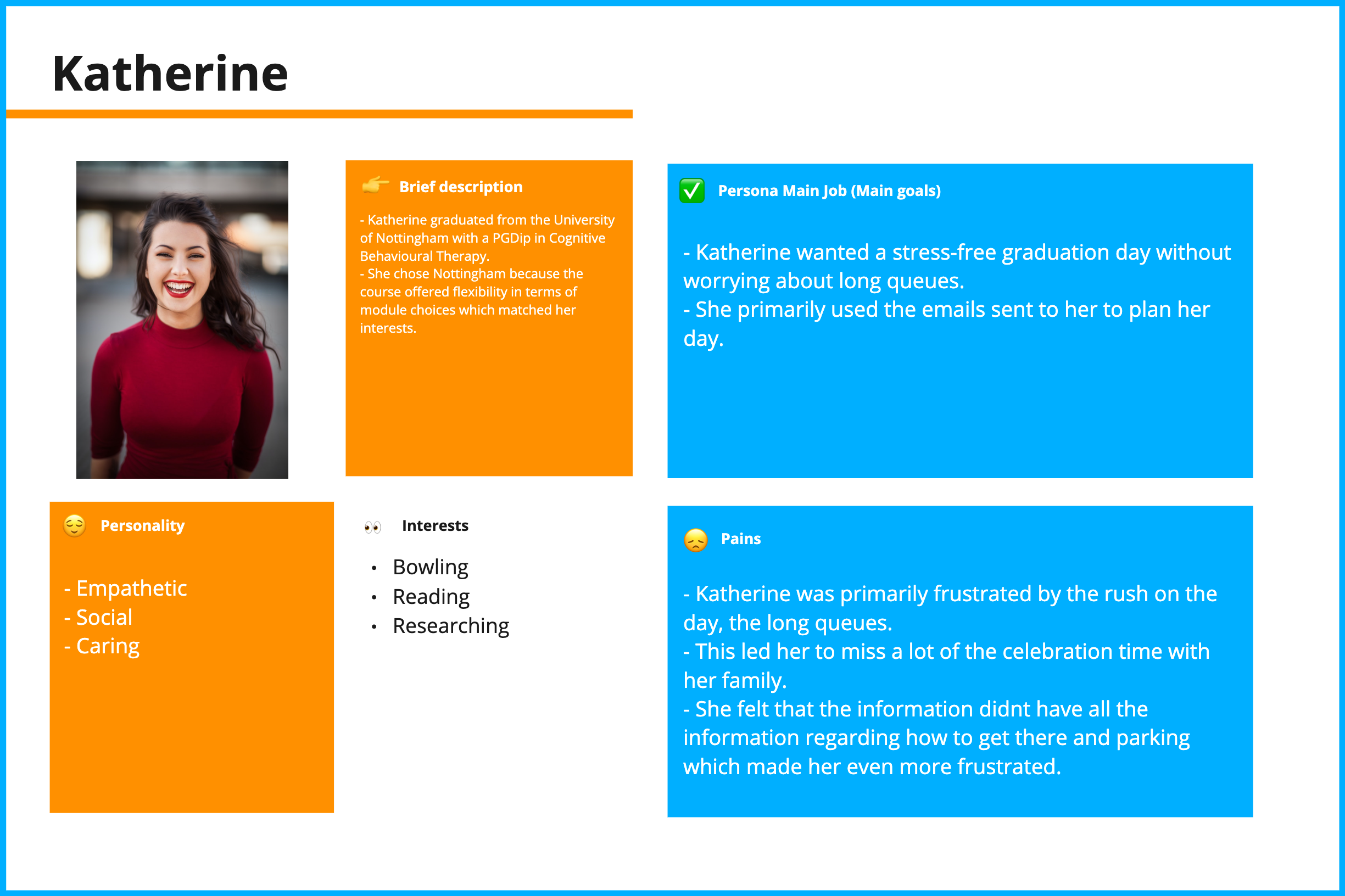
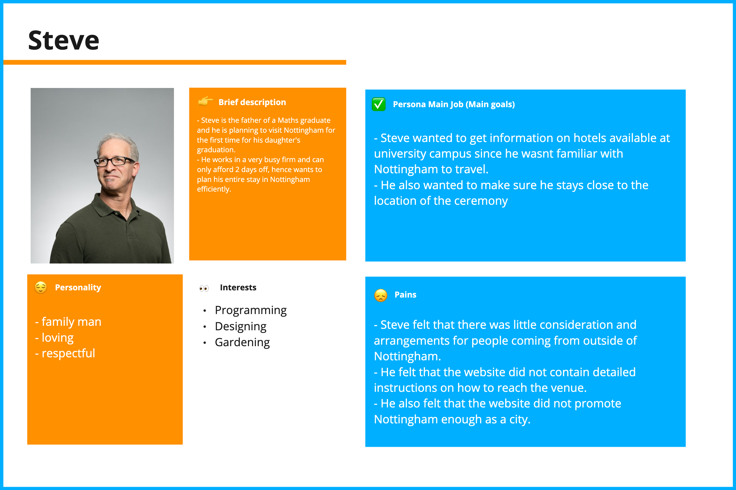
User personas
After compiling all this research onto a miro board and showcasing the findings to the product owners, I started creating different personas that may use the system and the particular user scenarios in which these users may encounter using the system.
Ideation
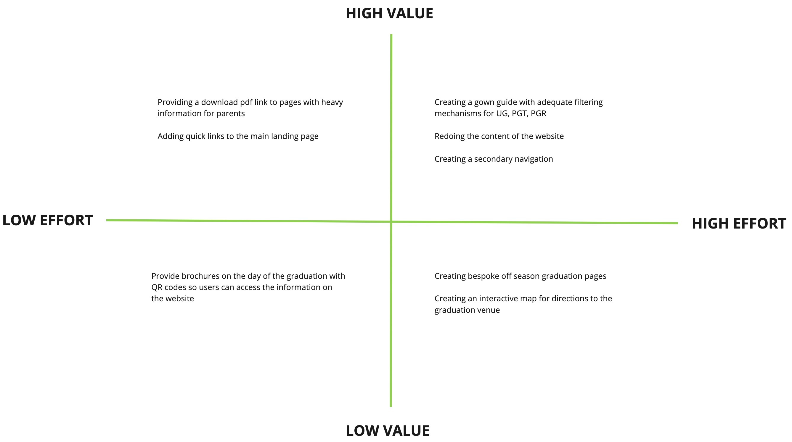
Feature prioritization
After realizing what solution would bring the most value for my users, I decided to take it a step further and brainstorm the ideas for the actual features. I wanted to ensure that the website is easy to use even on the day of graduation when users may be in a rush to access specific information. The research part of this project and conversations with stakeholders provided enough information to determine which features will bring low vs high value to the user.
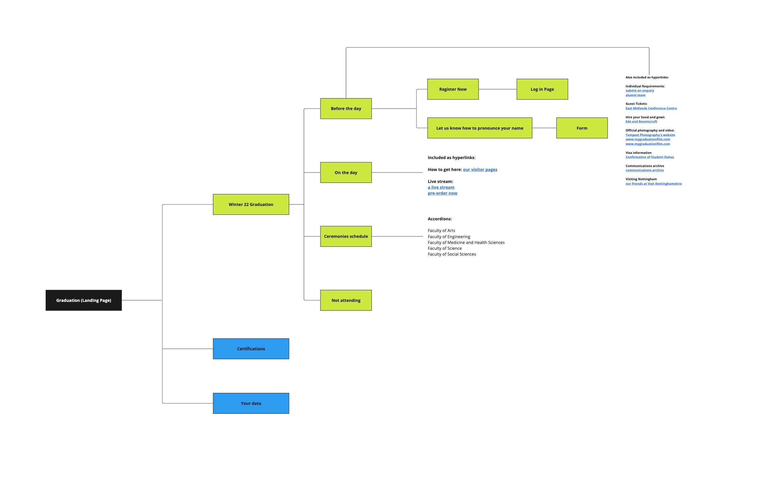
Information architecture
The best approach to design a new information architecture was to map out the old one and find the points where users felt frustrated and based on the research conducted and its outcomes, design a new user flow.
Old site structure
- The old flow does not have the presence of a secondary navigation bar and only has component cards on the main page
- The user may need to guess where the information they are looking for might be sitting
- Each of the pages only comprise of quick links whicc may take the user out of the journey
- Even though the journey is small and concise, it not meeting user expectations
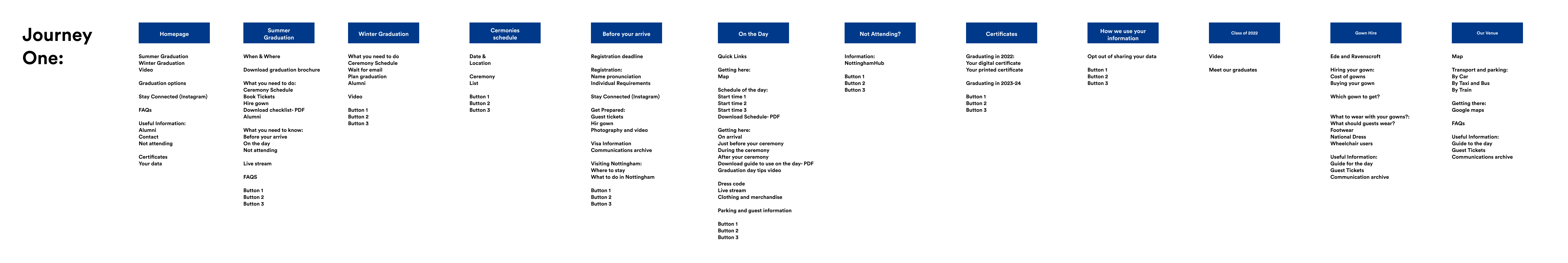
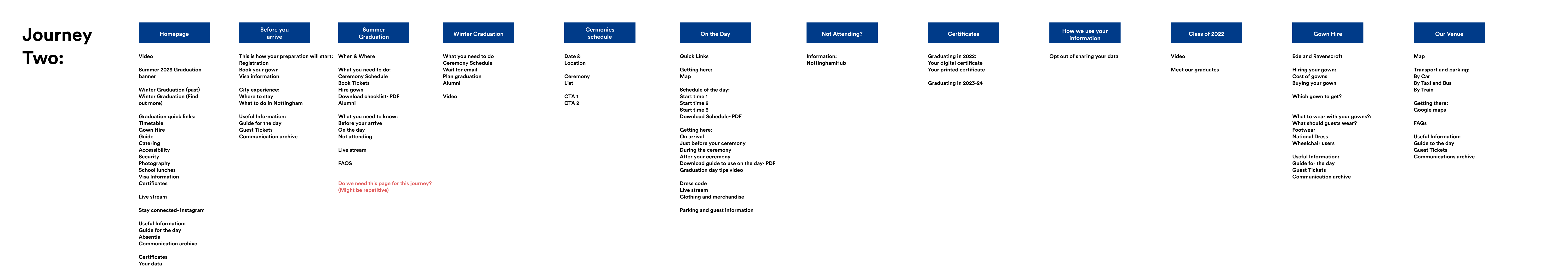
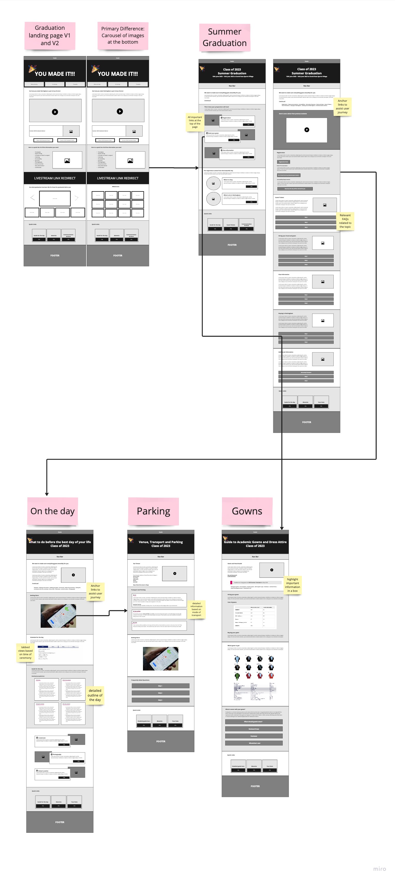
Proposed journeys
Based on the above findings, we wanted to propose two different journeys the user can opt for to
the stakeholders. Journey one can be classified as the ideal approach whereas journey two can be
considered as a backup approach.
Note: Both journeys incorporate the same set of pages but in different orders, hence that is
why 50% of the pages in both these journeys are comprising of the same content.
The main differences in the approaches include:
- Journey 1 would not provide any information about previous graduation ceremonies whereas journey 2 would comprise of a link to the information that was available to the last graduation season. This was introduced in journey 2 so that users can develop a sense of relief that previous graduands relied on the same information and were able to have a successful graduation experience.
- Journey 2 would comprise of quick links on the main landing page for main areas of the website such as "Gowns", "Photography", "Directions for the venue" etc, this was done incase the user misses to click on the CTA at the top of the page and finds quick links further down the scroll.
- Journey 1 would have a more detailed "Before you arrive" page in which the steps are broken down for the student whereas journey 2 has all the information they need in the form of text blocks which will house CTAs guiding user the right page.
- Even though journey 2 housed a separate "Summer graduation" or "Before you arrive" page, the thought was to have similar information on both pages based on where the user comes from.
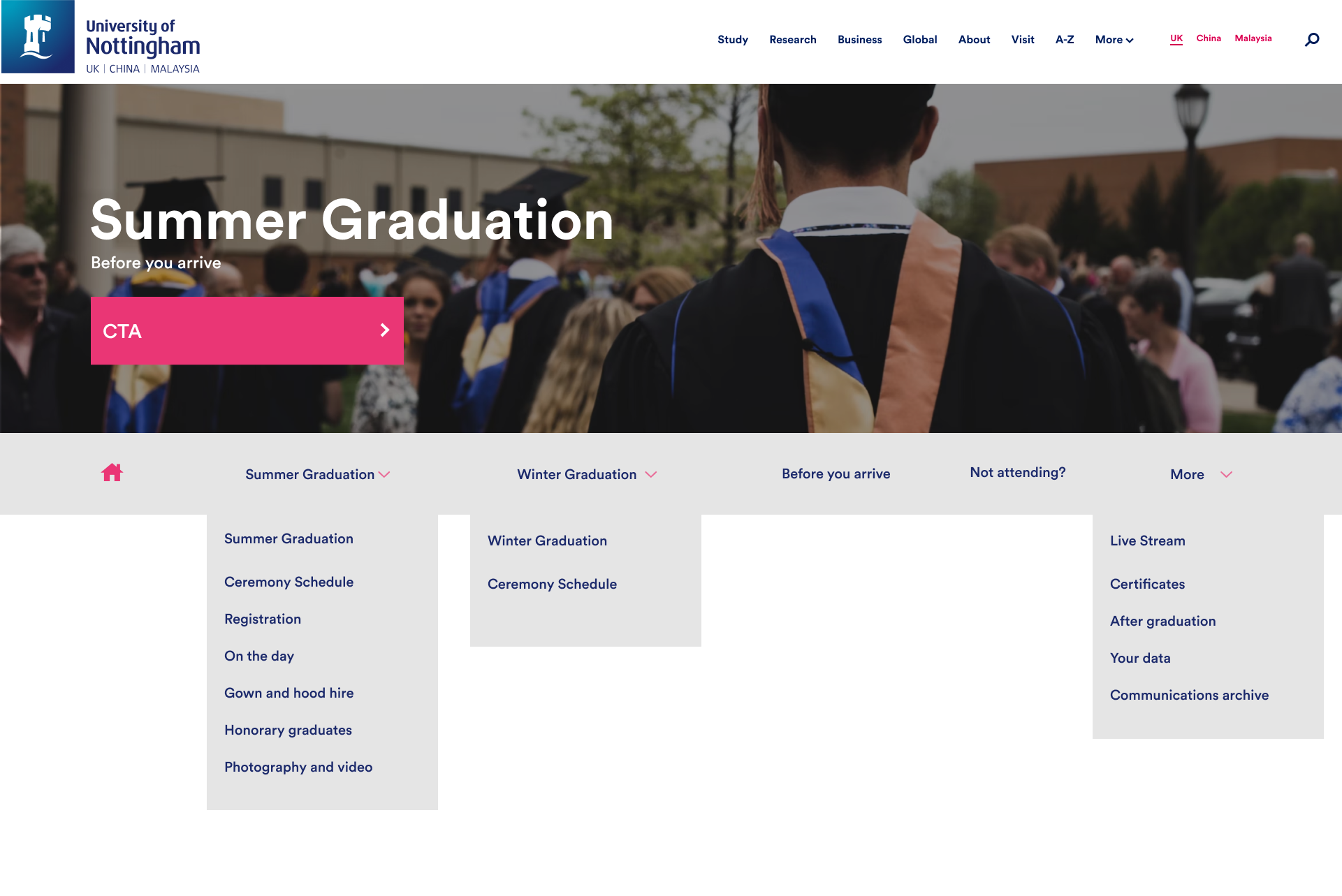
Proposed Secondary navigation
Option 1
- Pulling out the current graduation season as the first link
- The future graduation season can be put under "More" since that will not be highly interacted with during off season
- On the day, Before you arrive and ceremony schedule are prioritized
- Information relating to gowns and photography can sit under "More"
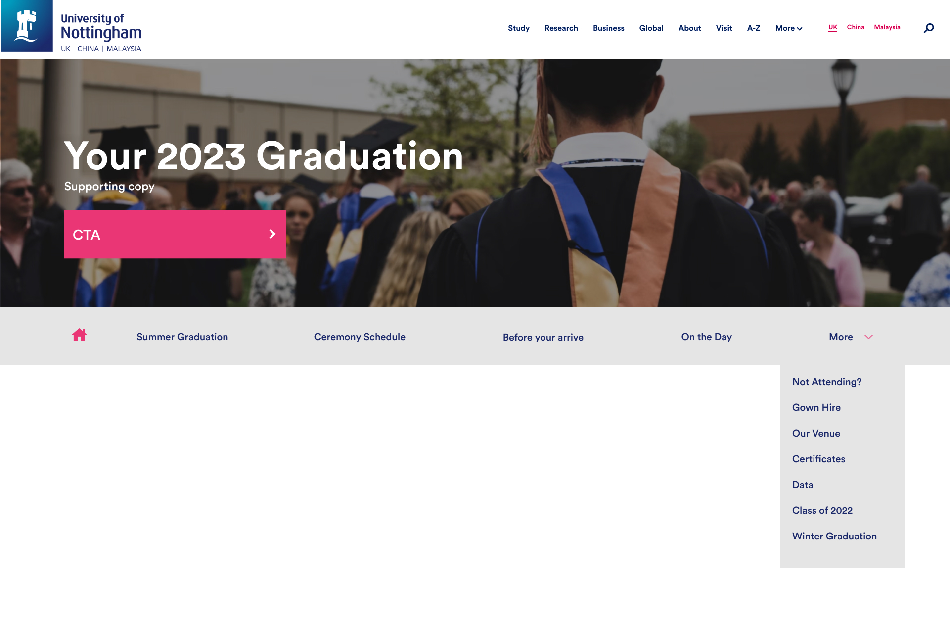
Option 2
Grouping both graduations inside one dropdown
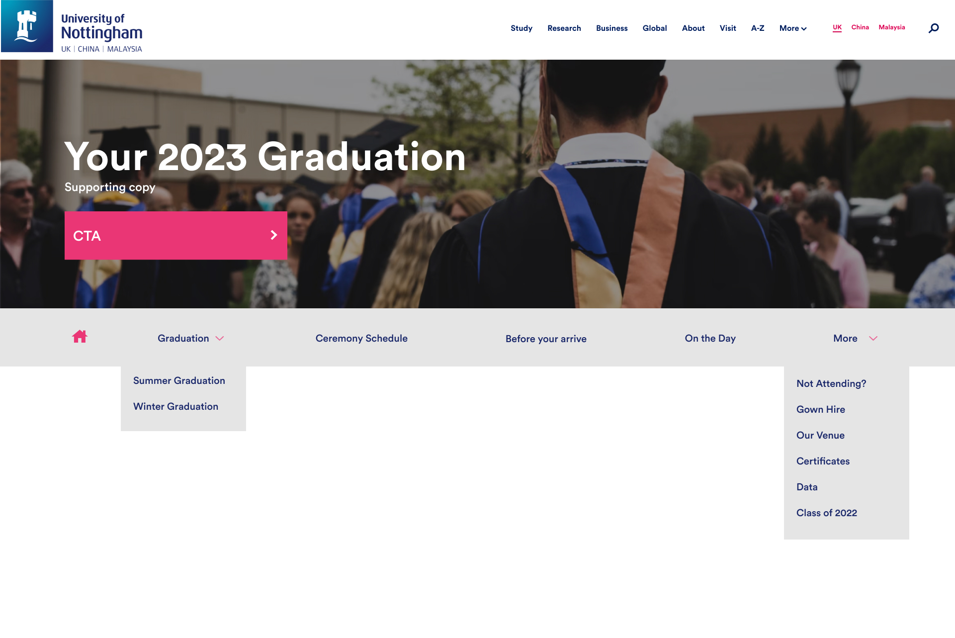
THE CHOSEN ONE!
This was the final navigation bar which was chosen by the product owners based on best usability practices and based on the research evidence gathered
Design
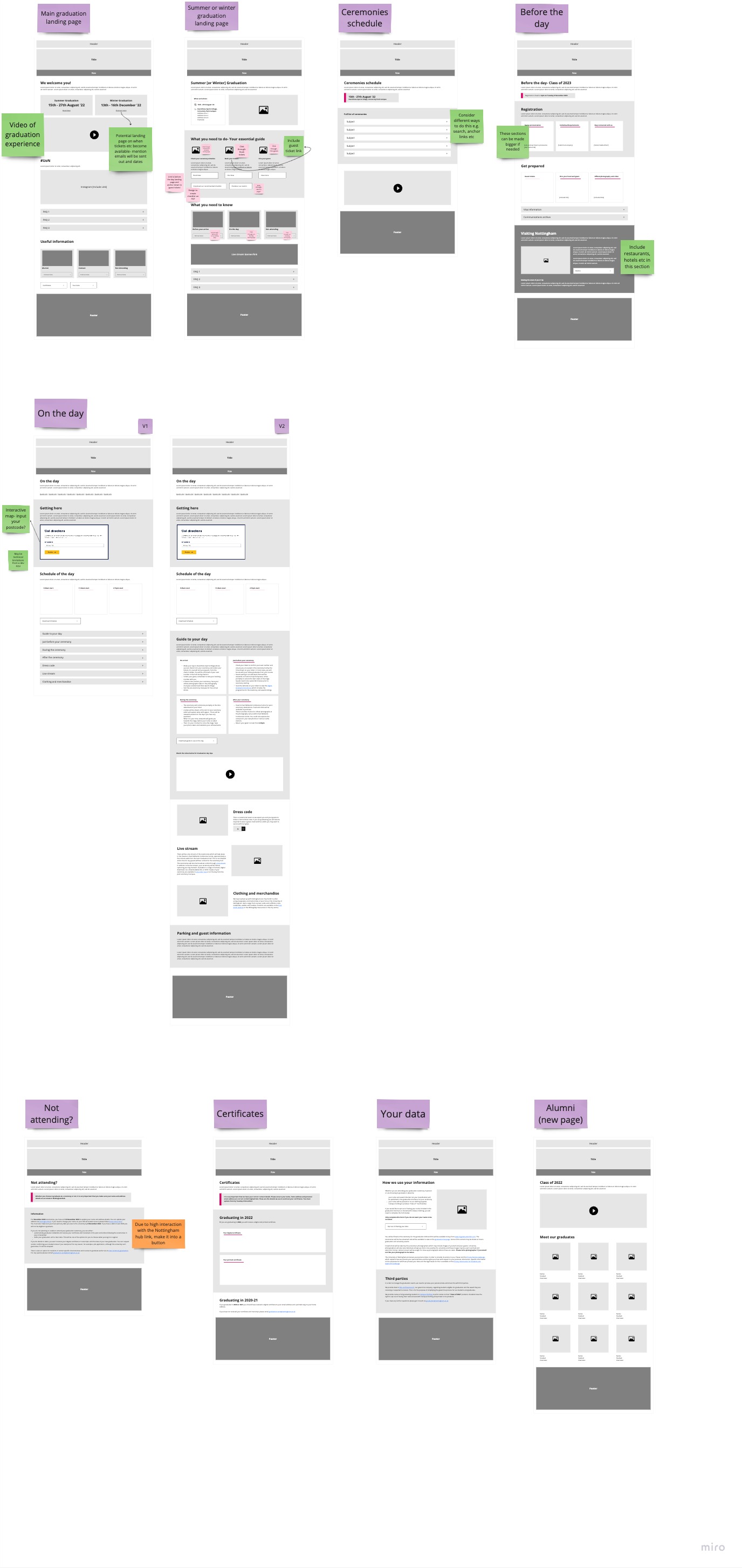
Wireframes
The first set of wireframes were designed with the mindset of improving the current journey but with better usability practices such as providing relevant CTAs for each information section and making sure the information is digestible. We also adopted the quick links section on the landing page.
The second set of wireframes incorporated feedback from the stakeholders and broke up each step of the journey into detailed steps such as:
- Breaking down steps into a checklist
- Adding quick links to each page to help user to the next stage of the journey
- Creating pdf versions of important and information heavy pages
UI
The final UI can be viewed using the following link: Click here
The UI process became very messy and involved a lot of iterations for some of the pages even though
the stakeholders had signed off the wireframes. This was because stakeholders such as the Alumni
team and the wider graduation team were involved later on in the process due to lack of availability
of time in their calendars.
This involved:
- Creating an After you graduate page which can promote alumni relations after students leave the university
- Creating an Honorary graduates page so that can be taken out of the printed brochure
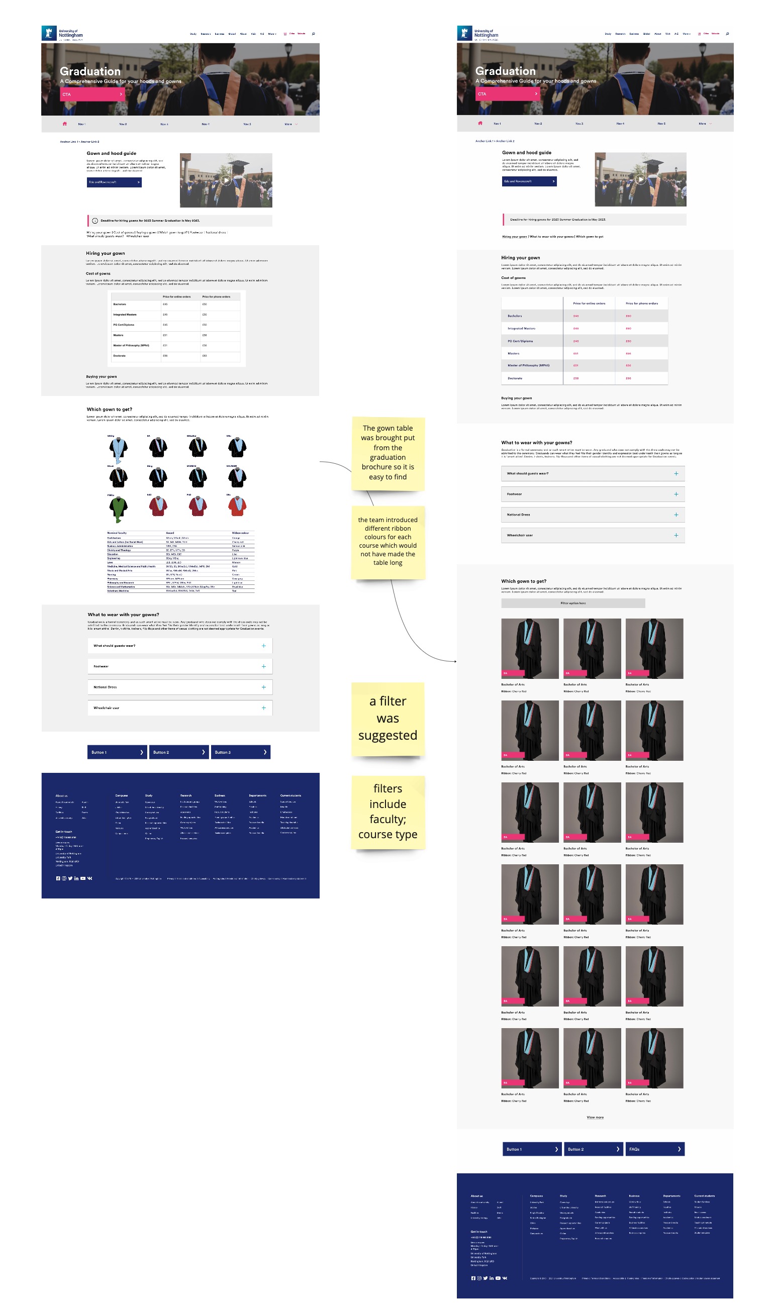
- Creating a filtered approach to the gowns rather than a tabular approach since there was an addition of 16 different ribbon colors being introduced for the new graduation season.
The main graduation landing page
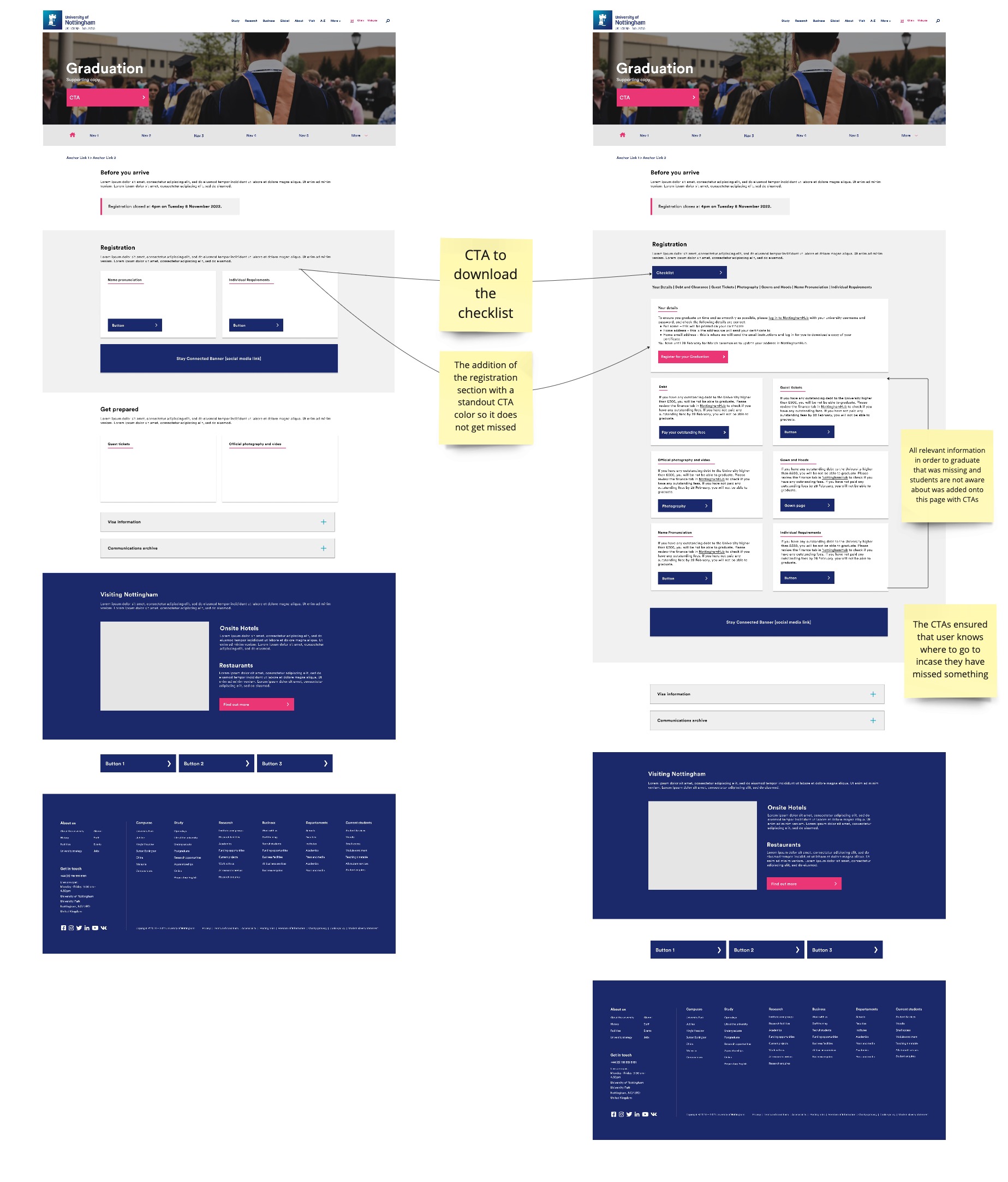
Before you arrive
Gowns and hoods
Challenges and learnings
Stakeholder management
During the initial stages of the project there were 2 primary product owners who were
liaising regarding the requirements of the project. Further down the timeline, a number
of different stakeholders were introduced to us who were contributing in terms of
providing feedback. There was also the case of graduation team working with another UX
team to redesign the registration experience which was not communicated with us until
the later stages which means there was duplication of effort and work.
Learnings: Ensure that all relevant stakeholders are involved in the kick off but
feedback will only be given by the product owners as too many opinions may cause more
harm than good
Navigation
As UX designers, we need to make sure that all user groups have a good experience with the website and any edge cases can be handled as well. The secondary navigation bar was a challenge, especially when it came to convincing stakeholders on how it will work and how it can support edge cases of scenarios as well.
Learnings: This would have been a good area for usability testing, however timelines were very tight and dev work alone took 2-3 weeks. Moving forward, projects will be managed in a way that can allow some time for usability testing with key user groups.
Handling off season graduation
This was a challenge because the team did want to provide information for future graduation ceremonies, however we needed to create a journey for a "dark period" as well i.e, when no information is available for either graduation ceremonies. We also wanted to make sure that if a user is looking for a future graduation season they are able to access it easily, hence it was decided to have it in the main nav bar.
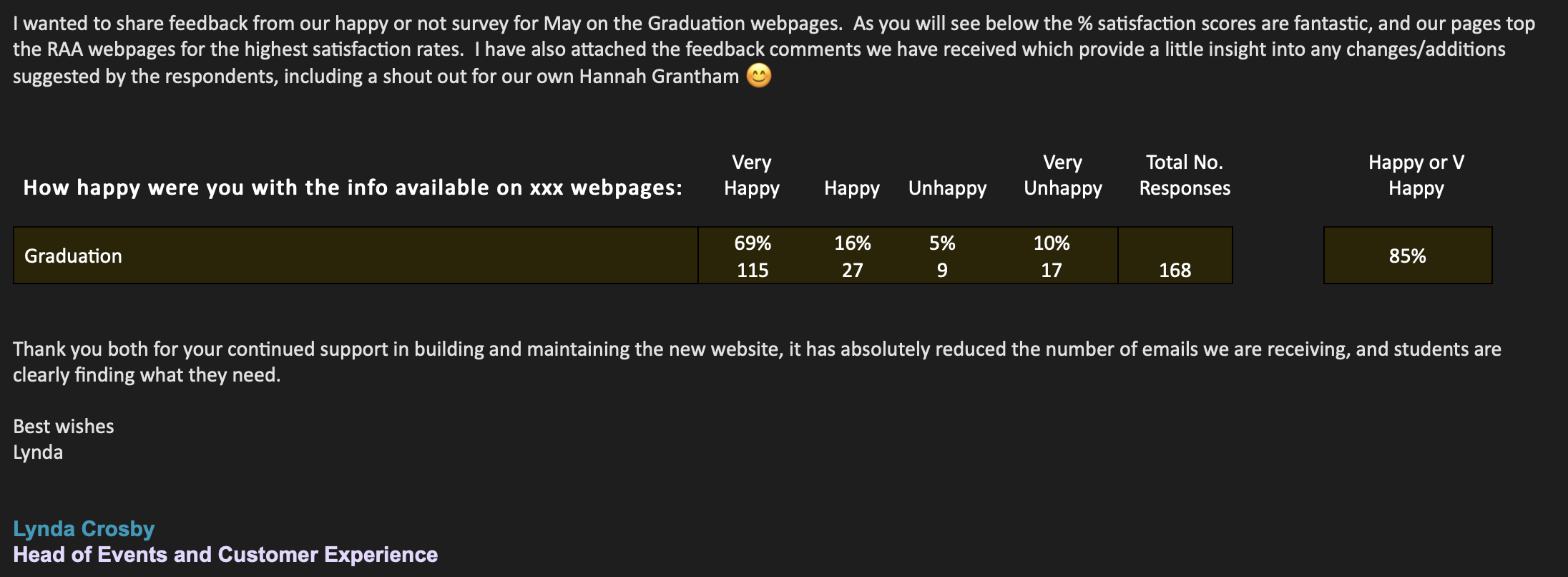
Key Metrics
Time-on-task reduced
as average time reduced from 4 minutes to < 2 minutes
Task success rate increased
from 47% to 83% based on testing it with 25 users after it went live
Seasonal queries reduced
from 2000+ enquiry emails in Summer of 2022 to ~150 emails in Summer of 2023
Improvements after 4 months of going live...
Conclusion
Overall this was one of the first large scale end to end projects that I worked on with the
university. I conducted proper 1-1 interviews, did usability testing and analyzed data and heatmaps
to make data driven design decisions.
What I would have appreciated is the opportunity to A/B
test
some of the components such as where do users prefer live steam links or is the off season
graduation season getting any form of interaction in the main nav bar. This area of the website will
be evolving continuously so it will be interesting to see if the new journey is being accepted by
users.
The primary stakeholder for this project did inform us that graduation queries have come
down in
2 months or so which is a drastic improvement and shows that users able to find the information they
are looking for.