Coming Together
Delivering improvements and UX recommendations to make the website more user friendly and SEO compatible
Client: Nikolaos Papadogiannis, Founder of Coming Together
Role: This project was done as a deliverable for a Master's module where we had to work in teams. I was a member of a 4 person team and contributed significantly in conducting user research and liaising with the product owner.
Problem Statement
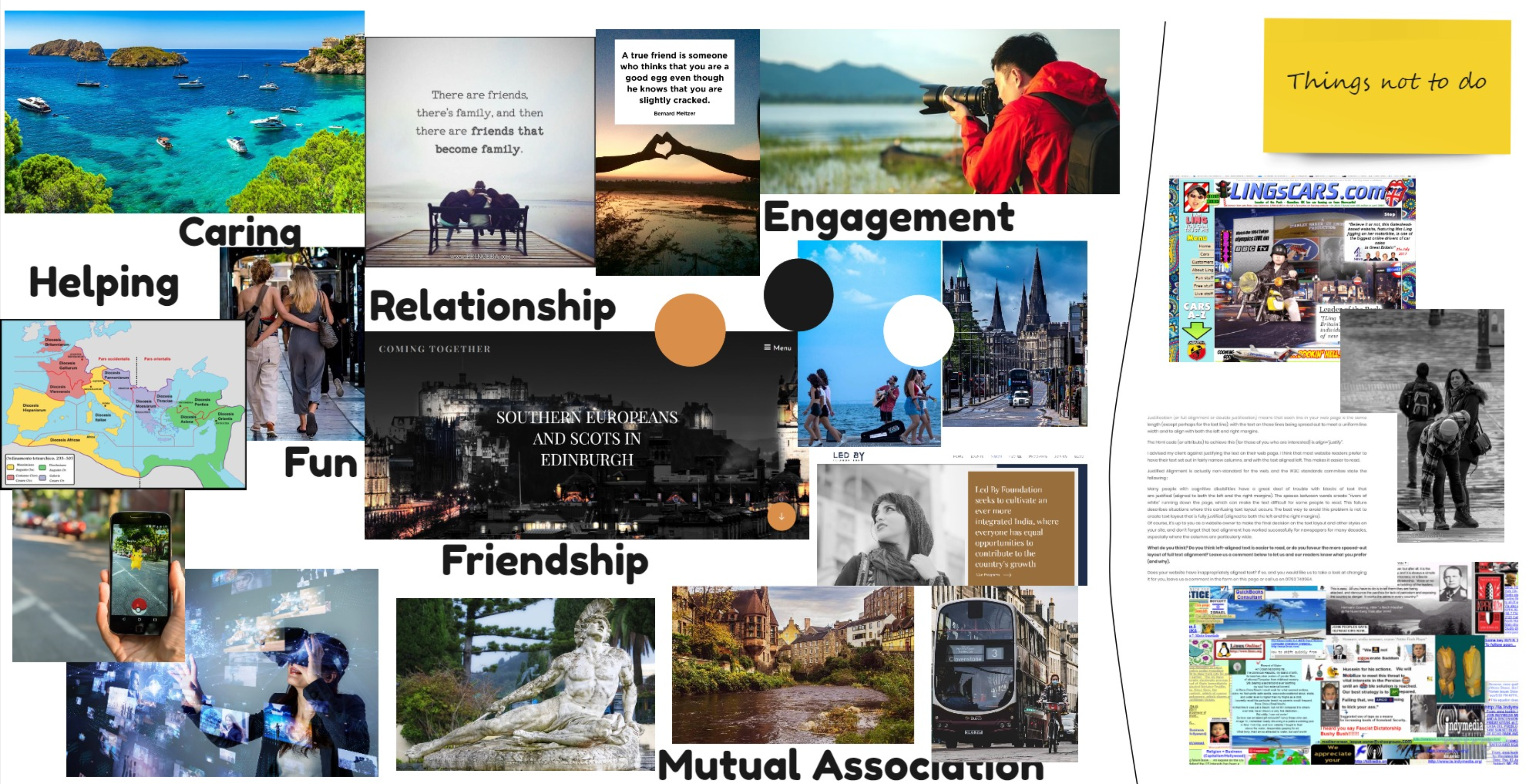
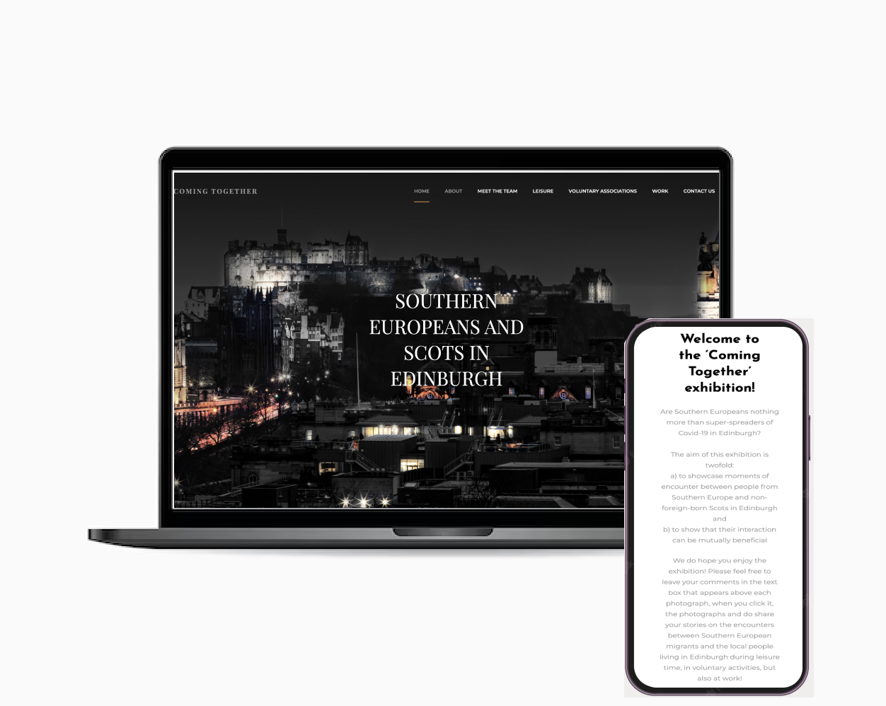
Coming together is an online exhibition that showcases and promotes the peace and harmony that
exists between Southern European Migrants and Non-foreign born Scottish people living in Edinburgh.
This exhibition was created after Brexit when an invisible barrier started appearing between the two
groups. It aims to promote this relationship in 3 broad areas: work, leisure and voluntary
associations.
Our client was just pushing one requirement when we met him in the kick off meeting, "Make the
website more interactive". He was also very keen on us to propose suggestions on how Coming together
can be more searchable on social media and more richer in material.
Coming Together stands on a very emotional and sensitive ground and therefore it was necessary to
ensure that
the data elicitation process is carried out without any form of presumptions. Our client wishes for
his exhibition
to become more
“interactive” which can have a lot of meanings for different types of users. Our team, consisting of
computer
science, marketing
and business backgrounds, unanimously decided that in order to understand the meaning of the word
“interactive” we
needed answers
to the following questions:
- Is “interaction” really the need?
- Who are the main users of the website?
- How do different groups of people perceive interaction? Is it bright colors or good content or something else?
- What is the need for people to “interact” with Coming Together?
Research
Goals
Below are the area I'd like to explore during user research.I want to understand:
- What are the key bits of information users want to get out of the website?
- The pattern of finding the information
- The detail and depth of information the uses are looking for
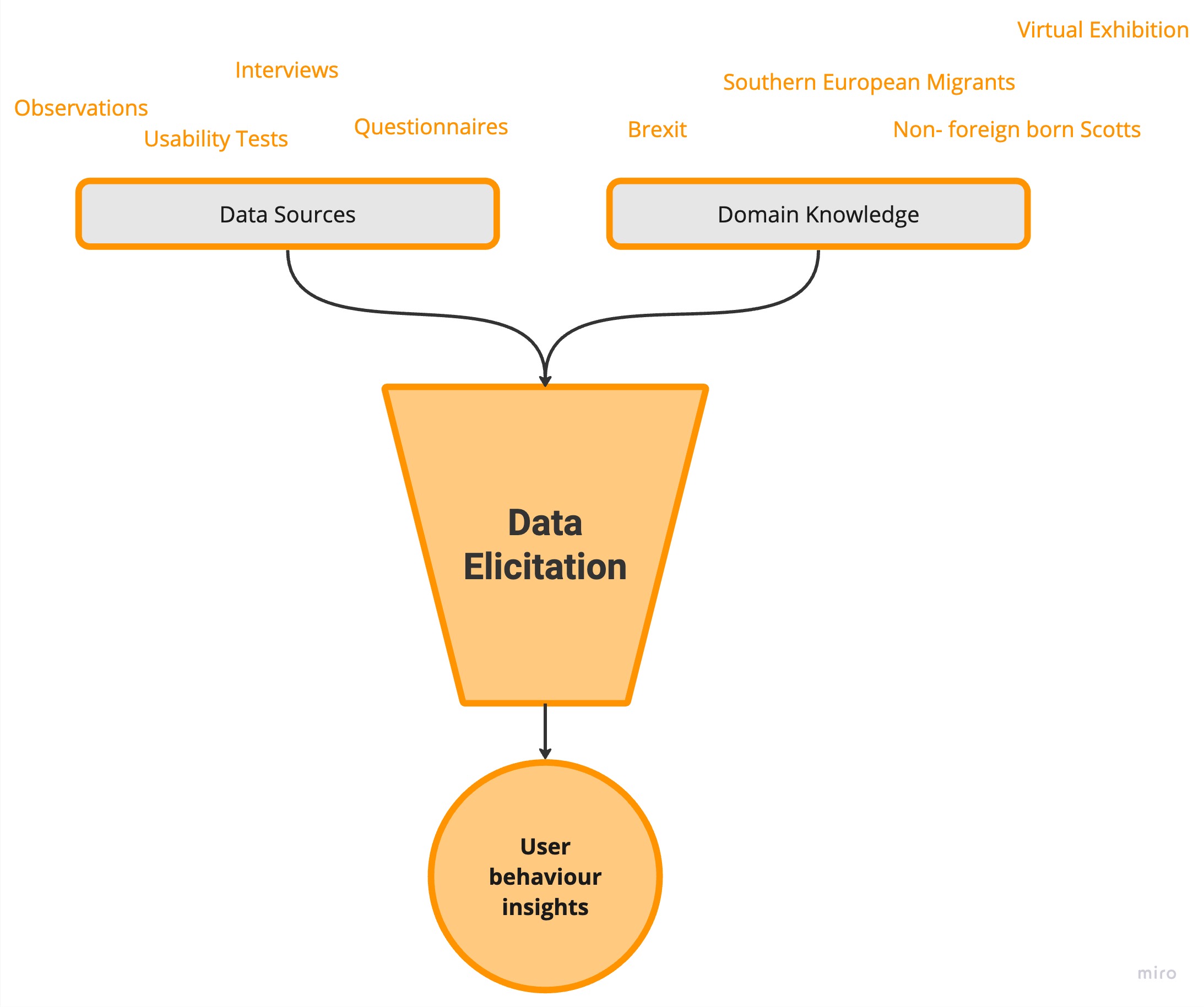
- Domain knowledge was crucial to understand the vocabulary our client mentioned in his project brief, specifically, “Brexit”, “mutually-beneficial relationships”,“southern european migrants” and “non-foreign born Scots”. It also helped us understand the goals, the online presence and the overall system architecture.
Methodologies
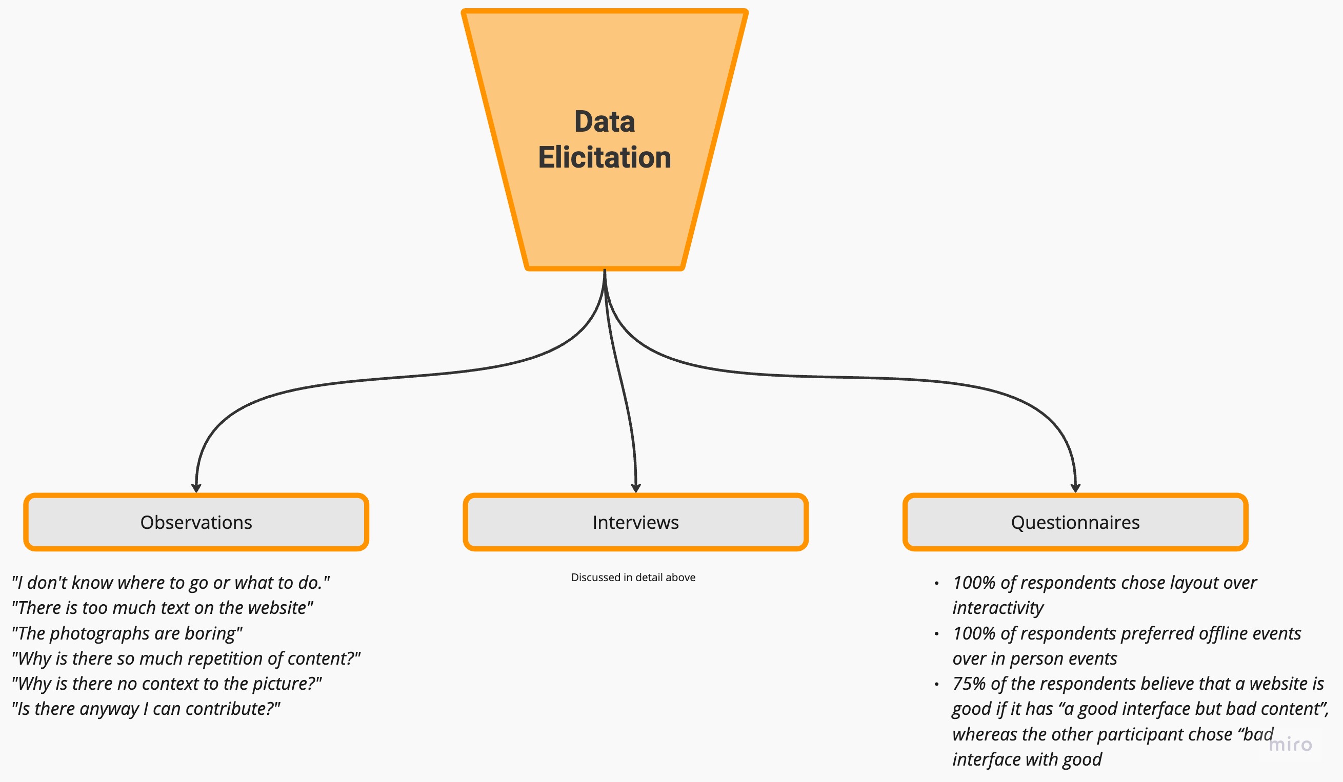
Since the data elicitation was less rigorous, i.e, having budget and scheduling constraints the following methodologies were adopted:- Usability testing of the website with 5 users
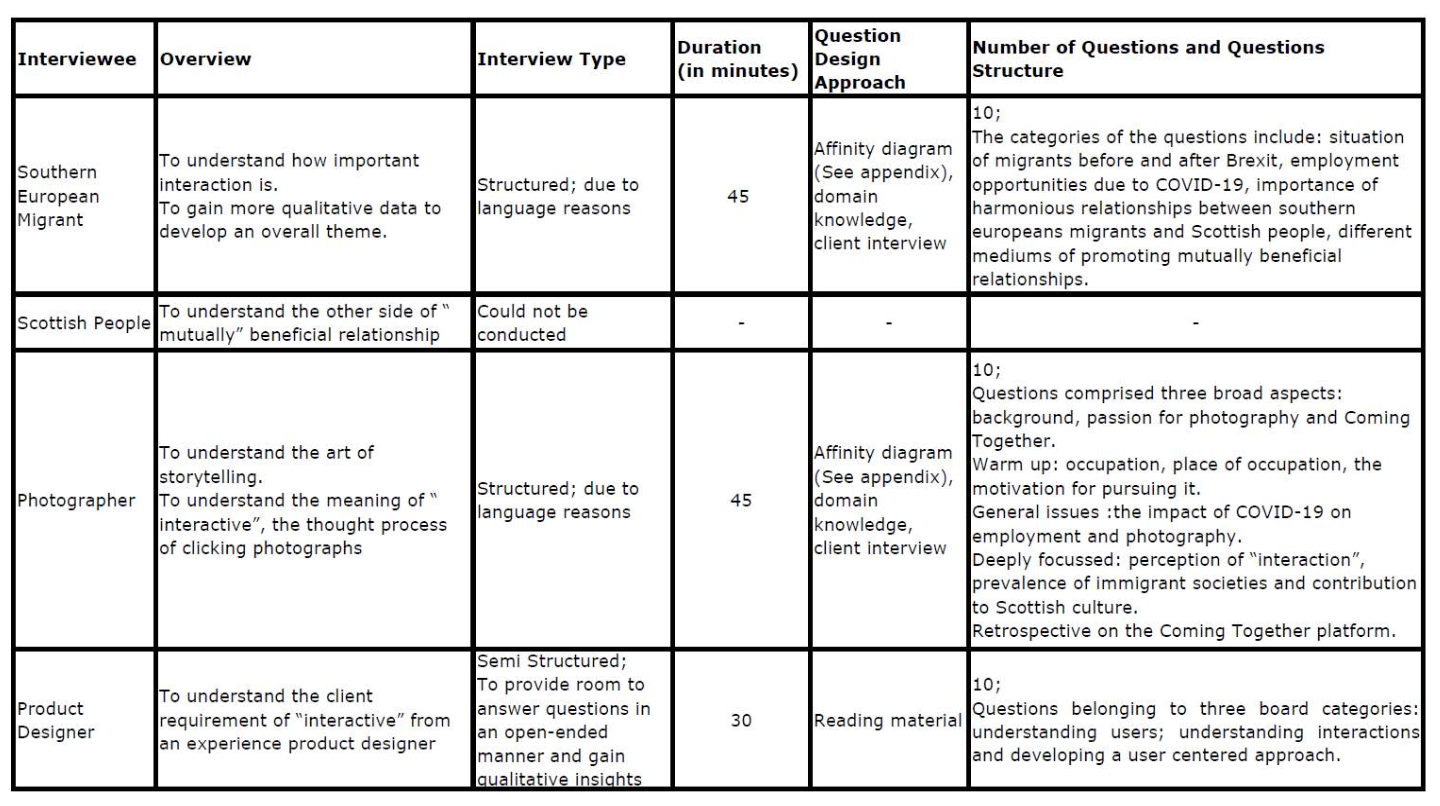
- 1-1 semi structured interviews with the client, a photographer, a southern european migrant, a few Scots and a product designer to understand what are they're expectations from an online exhibition
- A short questionnaire for Southern European Migrants and the general public to understand what are they're expectations from an online exhibition
Usability Testing
The objective of the usability testing was to understand what people expect from the platform, how
they intend to use it and what scan paths do the users follow.
The following user groups were invited as participants for the usability testing sessions:
- New Visitors: You are a first-time visitor to comingtogether.uk. Can you find the purpose of the website and navigate to the relevant sections.
- Event Seekers: You are interested in attending an upcoming event related to diversity and inclusion. Can you find event listings, filter events based on your preferences (e.g., location, date, topic), and register for an event.
- Community Members: You are an active member of the diversity and inclusion community. Can you access community resources, engage in discussions, and contribute your own content (e.g., articles, blog posts, or event recommendations).
- Partners or Sponsors: You represent an organization interested in partnering or sponsoring diversity and inclusion events. Test how clear and compelling the information is regarding partnership opportunities, benefits, and the process of getting involved.
- Volunteers: You want to contribute your time and skills as a volunteer for diversity and inclusion initiatives. Test how can you find volunteer opportunities, understand the requirements, and submit your application or contact the organization.
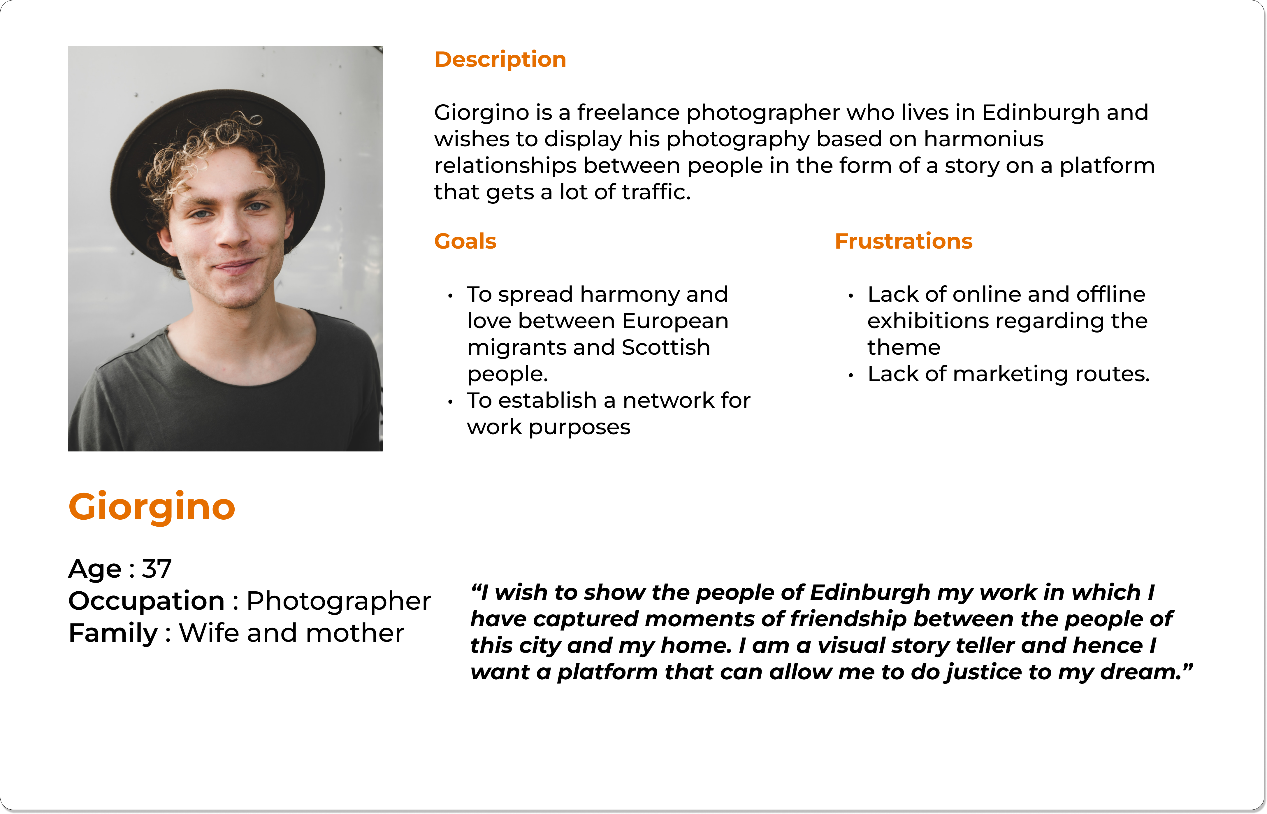
- Photographers: You want to contribute to theme of the exhibition with some of your freelance photographs. Can you show me how you would discover information about making a contribution.
Interviews
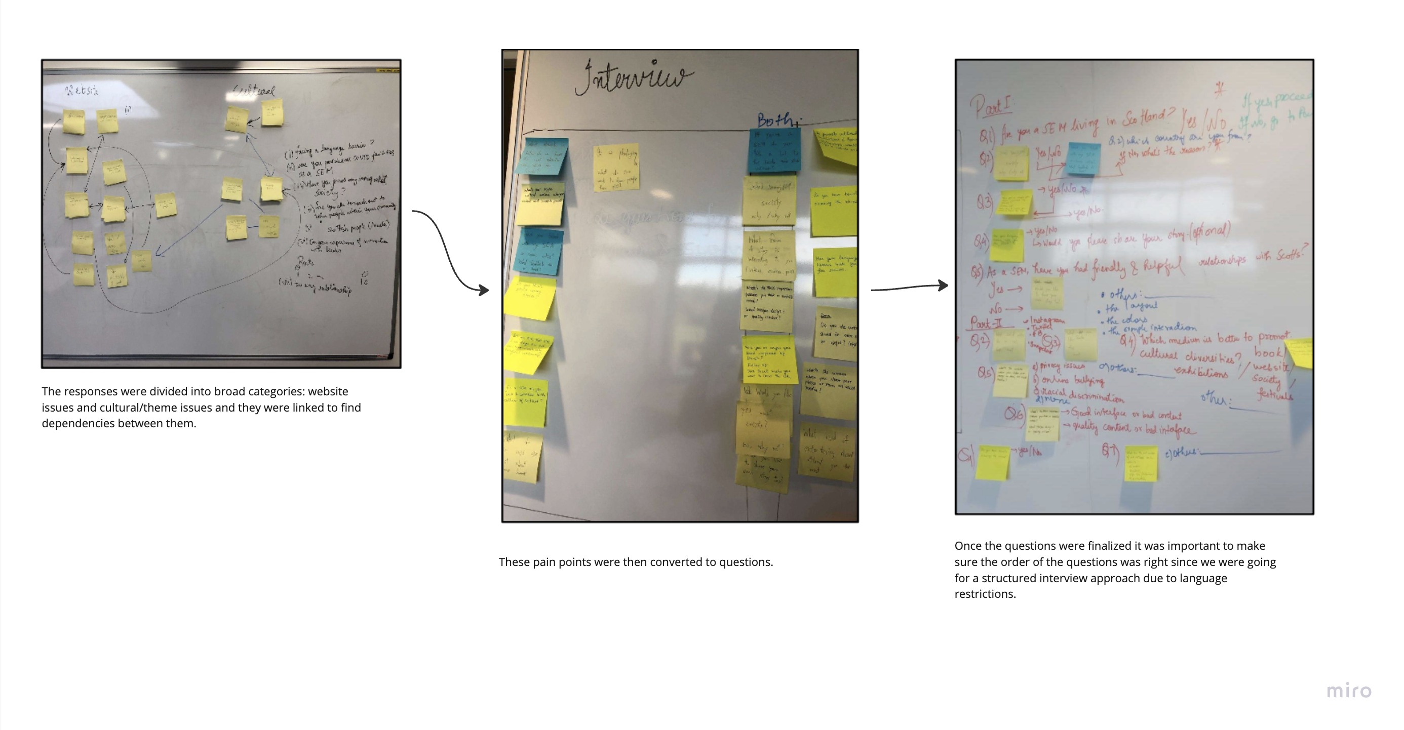
The interview questions were created using the affinity diagram approach using the outcomes of the usability tests and the domain knowledge that was gathered. A short summary of the interviews is available in the table below:
Research synopsis
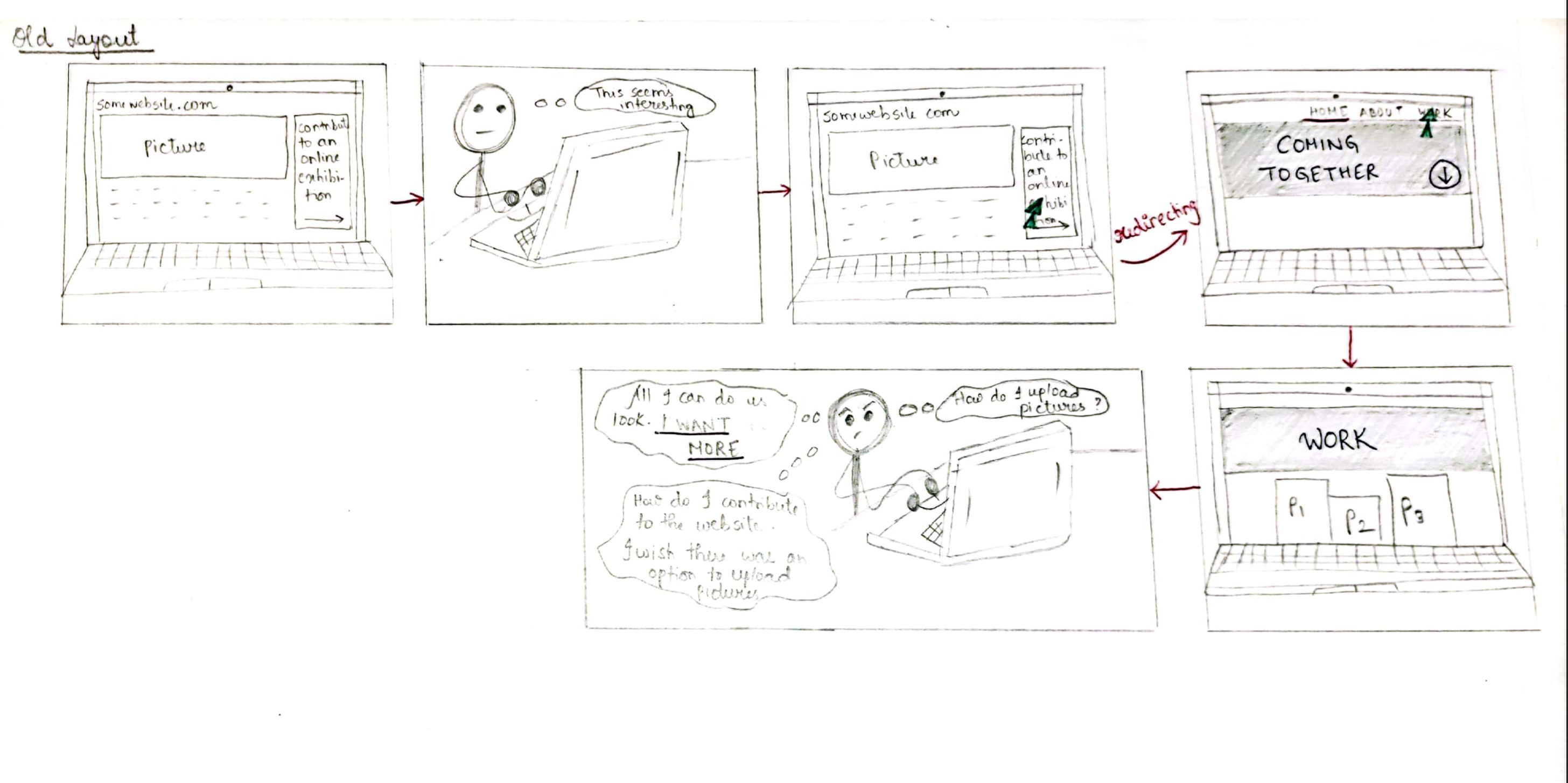
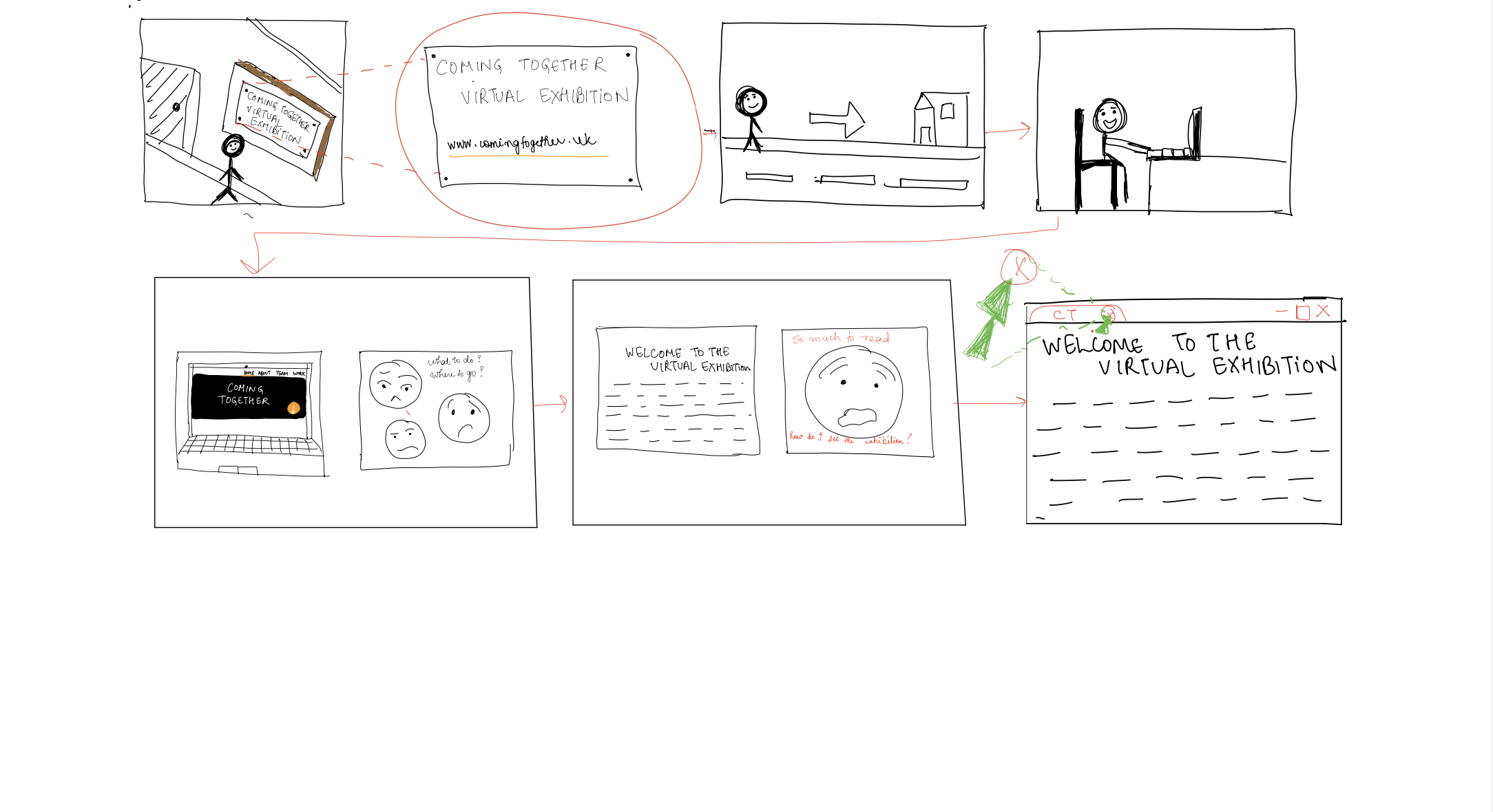
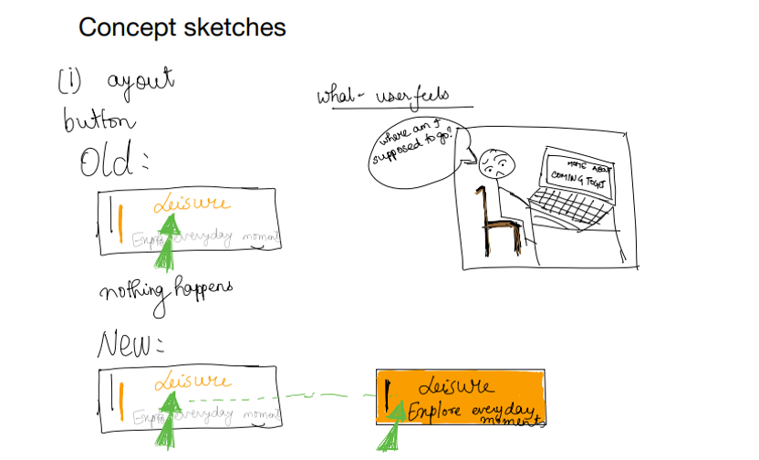
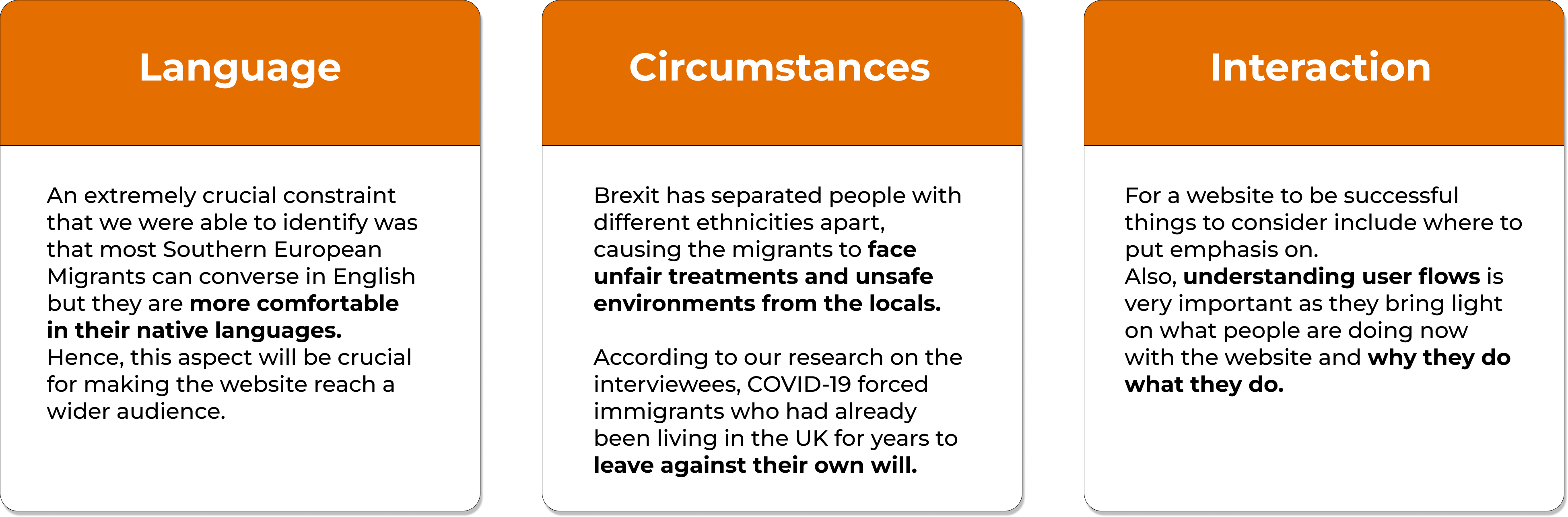
Brexit, COVID-19, and all the economic margin between the UK and other parts of Europe (except Western Europe) have separated people with different ethnicities apart, causing the migrants to face unfair treatments and unsafe environments from the locals. According to our research on the interviewees, Brexit decreases the will for Southern Europeans to immigrate to the UK while COVID-19 forced immigrants who had already been living in the country for years to leave against their own will. With the impact of both incidents, we believe the trend of ‘leaving the UK’ will accelerate even more in the future. Our client has spent tons of effort trying to build a platform that brings the local Scottish and Southern European immigrants living in Edinburgh together.In order for people to interact successfully with a system it is important to let them know where to put emphasis on, which part of the website should catch one’s eye leading to a successful user experience. Also, understanding user flows is very important as they bring light on what people are doing now with the website and why they do what they do. A good user interaction is only fruitful if it serves both business and user needs.
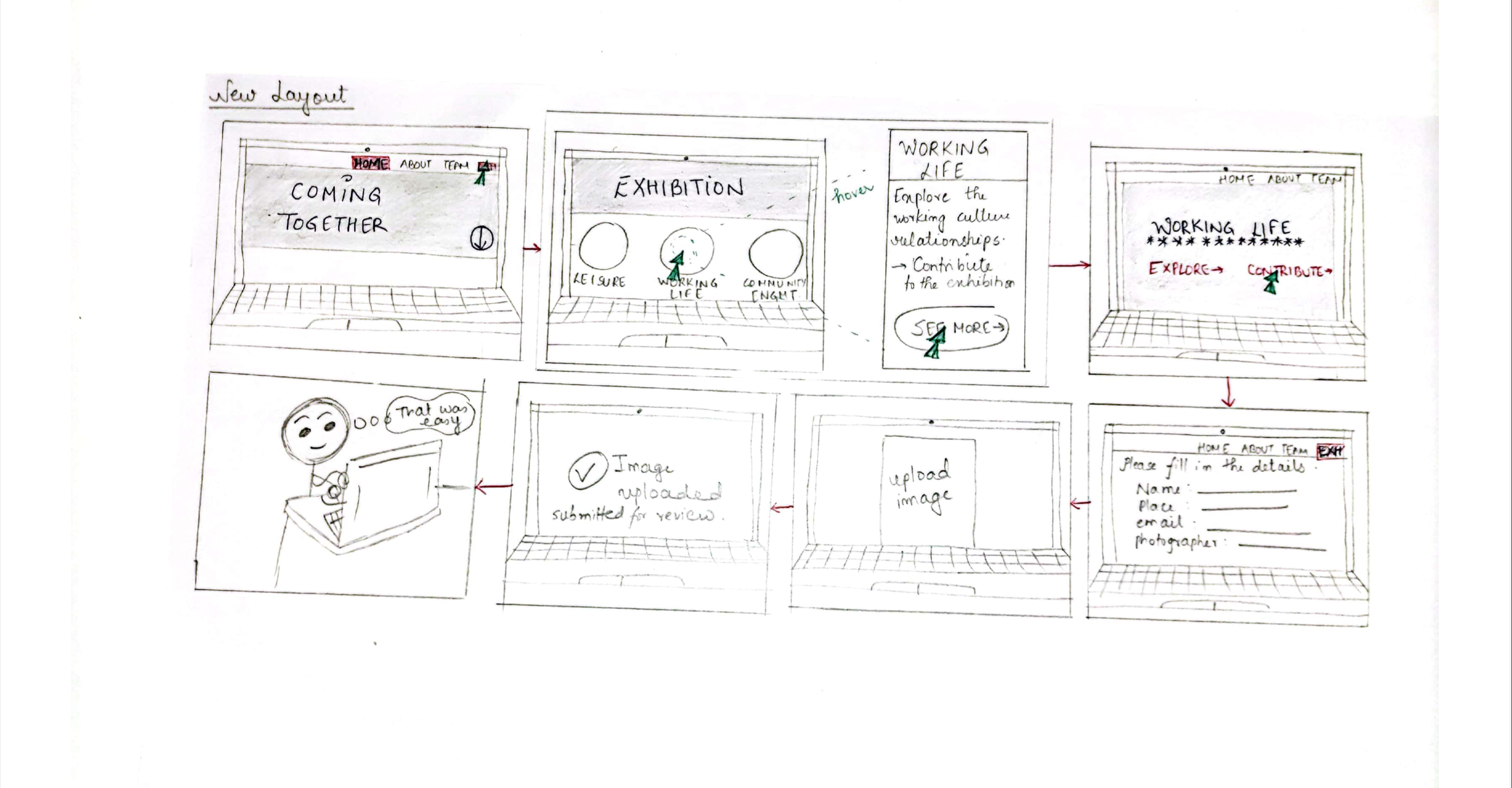
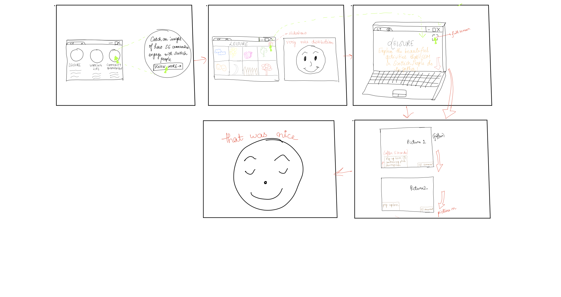
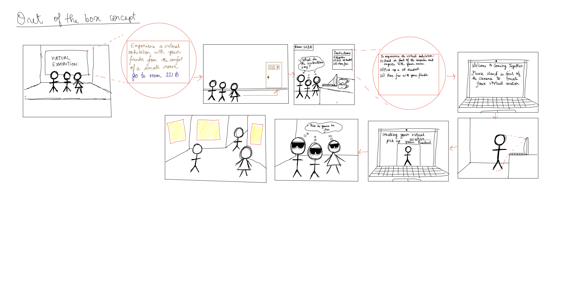
Pivot!
Apparently, from our analysis we concluded that it was not interaction that was the problem. It was “engagement”. As evident from our observations, people did not know where to go or what to do. There is no sense of direction to guide the user to navigate through the website and make them stay. Due to the static nature of the website, users “lose interest” quite quickly. There is no area where users can contribute to the website. Until people are “engaged” with the website, “interaction” will be a secondary issue.Survey
The survey received only 3 responses. Some of the key stand out points from the survey include:
- All of the respondents like social media apps because of their layouts and only 1⁄3 added that interactivity is also important.
- All of the respondents preferred offline events over online events to promote cultural causes.
- Most of the respondents believe that a website is good if it has “a good interface but bad content”, whereas some chose “bad interface with good content”.
Define
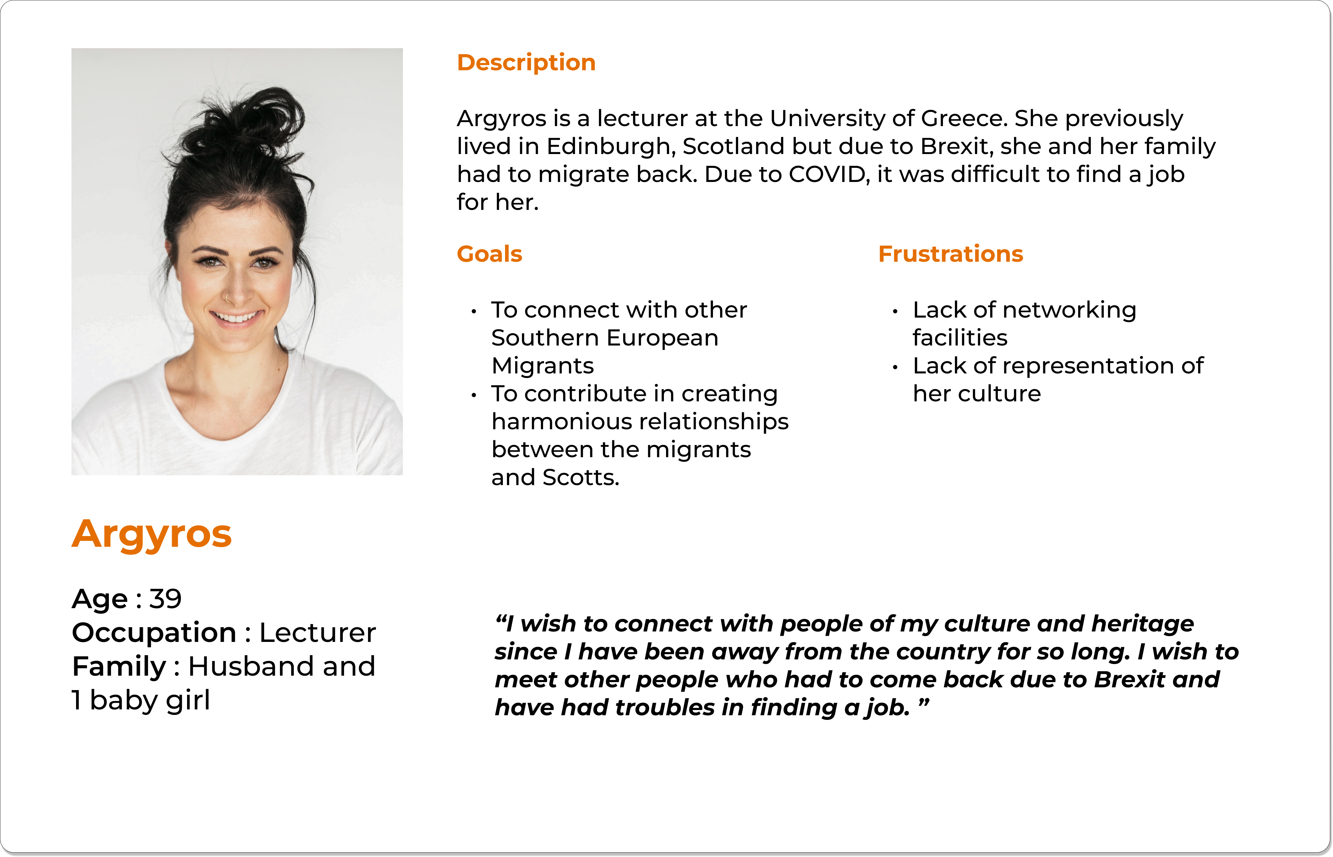
User personas
After compiling all this research onto a miro board and showcasing the findings to the product owners, I started creating different personas that may use the system and the particular user scenarios in which these users may encounter using the system.
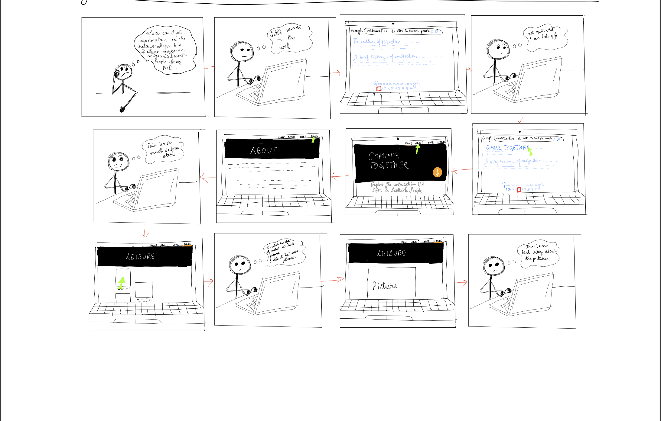
Scoping areas of interest
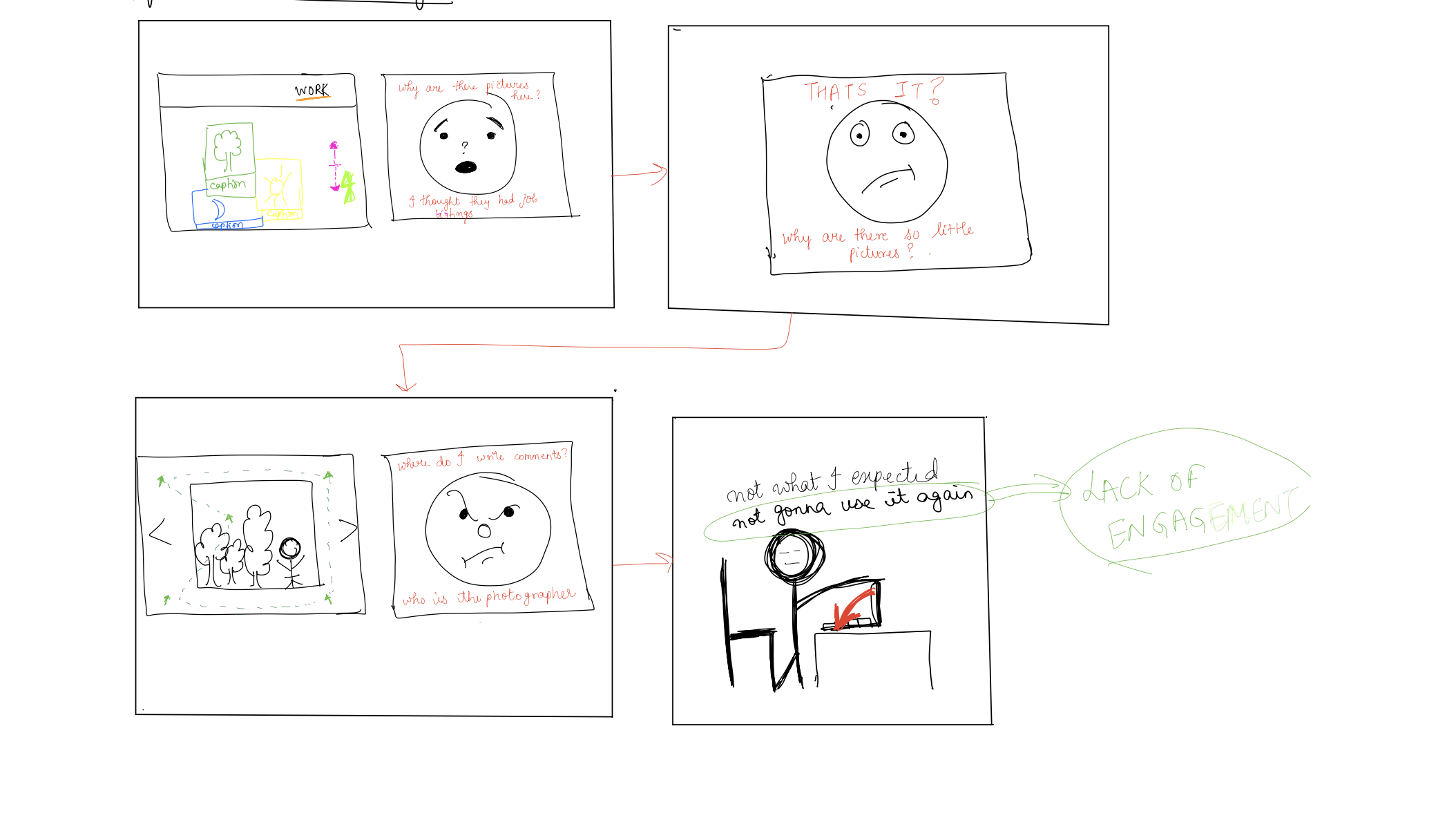
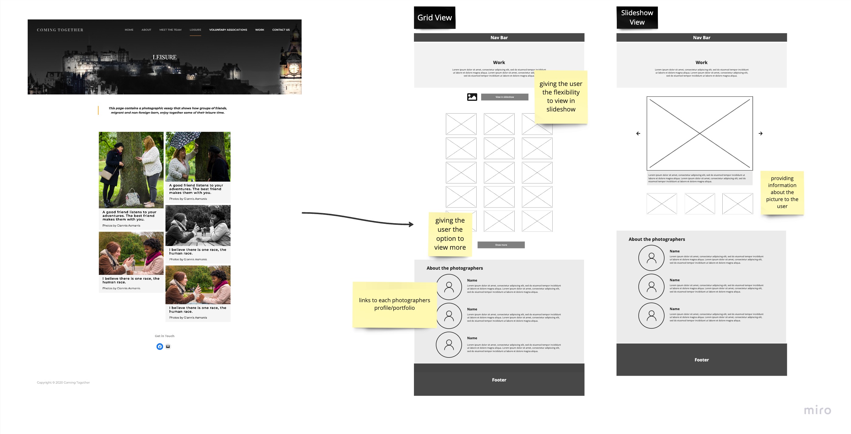
The word "engagement" was not in our discussion when we started this project until we conducted the interviews and observations. Engagement should be generated by the people who have contributed in building the website such as the photographers, website designers, and the management team. A lot of users mentioned how interesting the theme of this website could be if it could give people the motivation and interest to access it.
In the era of instagram, where content has become non-exhaustive and one can
scroll through hundreds of pictures, the amount of photographs on the website is very less which
makes the
users lose interest rather quickly.
A lot of the interviewees complained about the repetitive nature of the photographs and how the
pictures are
unable to convey a story that users are looking for.
The users complained that the photographs were not "colourful" enough which decreased the
engagement and
interest drastically for the users.
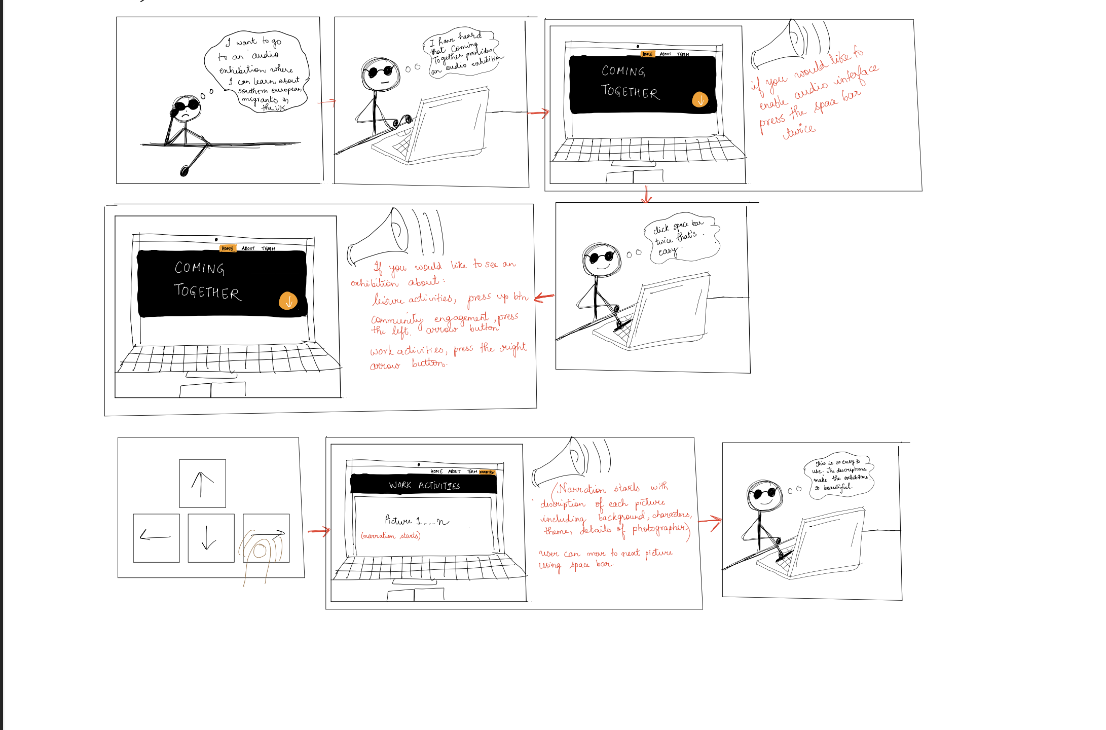
There is lack of interactivity between the users and the website. As we mentioned earlier,
engagement is the
fundamental problem of this project since it caused most of the dismay, but interactivity can
inspire
engagement, which is something the website has failed to accomplish. The website lacks the
features of
allowing users to leave their presence onto the website, interacting with other visitors of the
website
including the Coming Together core team. There is also a lack of audio-video aid which makes it
difficult for
specially-challenged users to interact with the exhibition.
The users for this area of interest mainly include visitors of the website which can be
broadly
classified based on their intent of visiting i.e, out of curiosity, to research, to contribute
or by
accidental visit.
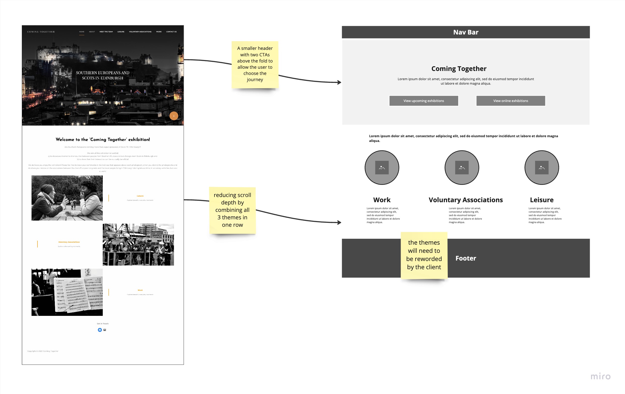
While analyzing our interviews, we noticed how most of the participants of our study complained about “too many words”, hence after some research, we landed on the term “Verbose” which means that a particular concept is explained in more words that what is required, which perfectly captures our next area of interest. Even from a research point of view, where too much information is good, most of the content on the website is repetitive which dilutes the purpose. The content becomes overwhelming for the visitors and hence it fails to engage them. We aim to address this by slicing down the content, using structured texts to improve the readability.