BloodLink
Creating a mobile application to shorten the gap between accessibility and availability of blood donors
Client: Jawaharlal Nehru Medical College, Aligarh Muslim University, India
Role: This was the first user centered project I had done as part of my final year dissertation. It has gaps in the process due to the fact I was not aware of a design thinking process at that time. I led the design direction of this project including the development stage while collaborating with 6 stakeholders.
Problem Statement
The proposed system will help the requester (patient) or hospitals locate nearby donors (volunteers) and forward the request for help. The requester must specify the blood group and the system will find the nearest volunteers having a compatible blood group. The periodic geo-location updates of the volunteer’s mobile device will help the system find the nearest donors quickly. Also, it will ensure the privacy of user data as the requester will be able to send requests to volunteers regardless of the volunteer's location. Only when the volunteer accepts the request to donate blood, the location will be sent to the database.
The main questions we want answers to are:
- What are we trying to solve?
- Who are the main users of blood bank applications?
- What information are different user groups trying to find?
- What are the problems associated with static blood bank applications?
- Why are the current systems of blood donation not being utilized to their full potential?
- How can these problems be solved to ensure the timely donation of blood and create public awareness in both rural and urban India?
Research
Goals
Below are the areas I'd like to explore during user research.I want to understand:
- How fast should apps process requests of finding a blood donor?
- In which order do users look for information in the case of an emergency?
- What information is crucial for processing a blood request?
Methodologies
- Reviewing the acceptance and awareness of blood donation data in India
- Reviewing proposals of systems made by software professionals and medical experts
- Breaking down the features of current blood bank applications
Data insights
What does the stats say?
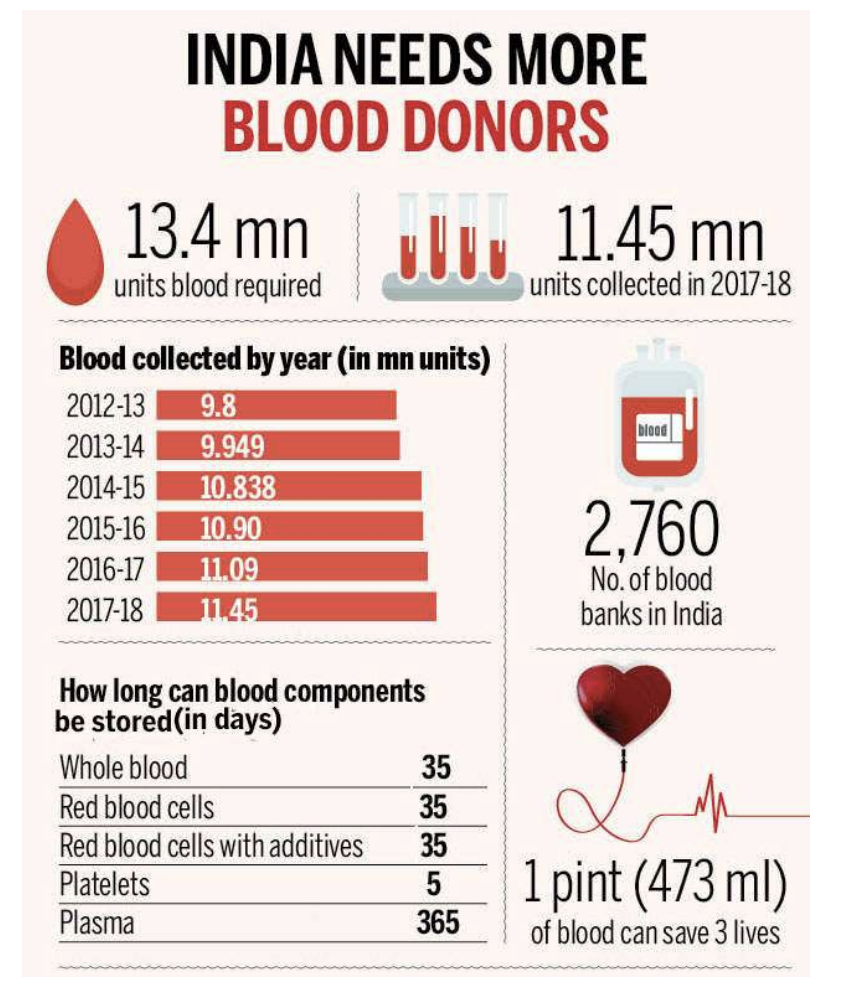
- In the past few years, India has seen an improvement in the blood collection from 9.8 million units in 2011-12 to 11.45 million units in 2017-18.
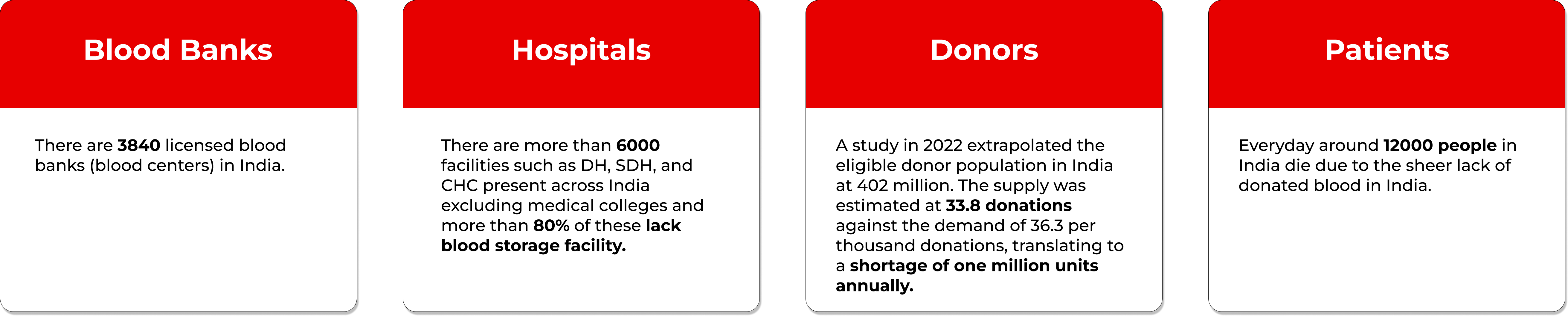
- According to Central Drugs Standard Control Organization (CDSCO), there were 2,760 blood banks in the
country
in 2015. The assessment exercise identified 2,626 functional blood banks across the country excluding 46
military blood banks.
- 1,131(43%) were supported by National AIDS Control Organization (NACO), Ministry of Health and Family Welfare, Government of India
- The remaining 1,495 were Non-NACO blood banks.
Annual Collection and Voluntary Blood Donation
During January to December 2015, the annual blood collection from all the blood banks that reported was 11,645,791
- 71.9% (8,378,692) units were through voluntary blood donations
- 28.1% were from replacement donations
What do the experts say?
The Optimization of Blood Donor Information and Management System by Technopedia by P. Priya and V. Saranya
- The writers propose a blood donor information and management system integrated with GIS in an android mobile application.
- The proposed system provides a needed and valuable service to the health sector by ensuring the quality of blood through a systematic process.
- The system solves issues such as misinformation of donors, misuse by third parties, and updating blood donation stock that exist in older systems.
- The proposed system is a web-based android application that reduces human mistakes in the existing system and uses wireless internet for data flow.
- The system is an integrated framework with a cloud-based application on mobile devices.
- Future work includes extending the application to process blood requests through SMS services, providing secure BTS to prevent misuse of donor details, and enabling strangers to become the helping hand during emergency situations.
MBB: A Life Saving Application by Narendra Gupta, Ramakant Gawande and Nikhil Thengadi
- Proposed system to link all donors
- System to control blood transfusion service
- Creation of database to hold data on blood stock in each area
- Data on donors in each city will be available
- People can see patients in need of blood supplies through the app
- Registration as donors available
- Clients can receive blood donation requests from local donors
An Android Application for Volunteer Blood Donors by Sultan Turhan
- Proposes a smartphone application for volunteer blood donors to increase willingness and accessibility
- Application helps healthcare centers provide blood quickly when stocks are insufficient
- Sends location information of available donors and blood requests to a main system
- Provides uninterrupted communication between healthcare centers and volunteer donors
- Optimizes distance calculation to determine donor eligibility based on actual distance
- Improves system infrastructure by moving to the Grade build automation platform
Competitor research
| Dynamic location of donor | Up to date databases | Data privacy | Transparent communication | Intuitive UI | |
|---|---|---|---|---|---|
| Donor2Donor | ✅ | ✅ | ❌ | ❌ | ❌ |
| BloodDonorMobile | ✅ | ❌ | ❌ | ❌ | ❌ |
| eBloodBank Mobile | ❌ | ❌ | ✅ | ❌ | ❌ |
| Infinity Blood | ❌ | ❌ | ❌ | ❌ | ❌ |
| OurBlood | ❌ | ❌ | ❌ | ❌ | ❌ |
| BloodLink | ✅ | ✅ | ✅ | ✅ | ✅ |
Summary
A detailed explanation of the problems with the current system are below:
- Dynamic location of donor: The current systems do not take the actual location of the donor into account, while searching them. This problem can be solved if the location of donor is tracked in real-time using GPS and location services. This will allow patients to find donors within their area and will also allow donors to donate blood to the patient in less time by covering less distance.
- Privacy issues: When patients search for donors using the current systems, it displays personal details such as name, mobile number and address to the patient making the donor’s information vulnerable. This problem can be solved by displaying the donor’s information only when she/he has agreed to donate blood to the patient.
- Outdated databases: The current systems usually save information of donors during the time of registration such as age, address, mobile number. However, there are instances when the user’s details are changed. Since the current systems are not real time, it makes the database outdated and ineffective. This problem can be solved by allowing users to update their information and details from within the Application.
- Lack of communication between patient and donor: The current systems do not provide any sort of communication medium such as chat or call, which can allow the donor to communicate with the requester/patient. This causes a gap between the donor and requester. This problem can be solved by an in-built chatting or calling mechanism within the app. This would allow the donor to communicate and with the requester all in all while maintaining the privacy of the donor.
- Complex user journey and interface: The interface of this application will be designed in such a way that a novice phone or app user will be able to navigate through the application easily. A “Help” section will also be provided for those who find difficulty in accessing the features of the application.
Define
Who are the users?
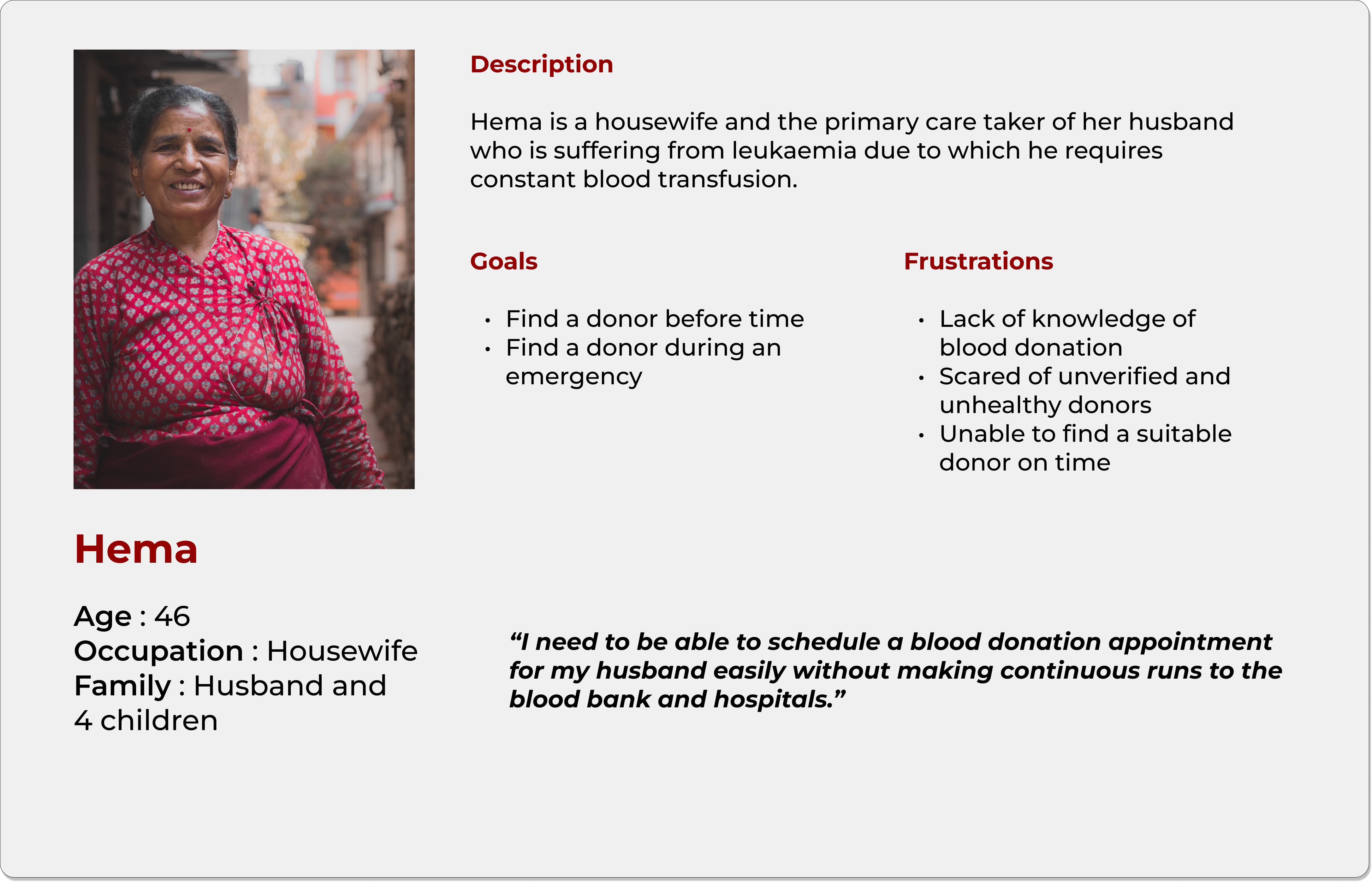
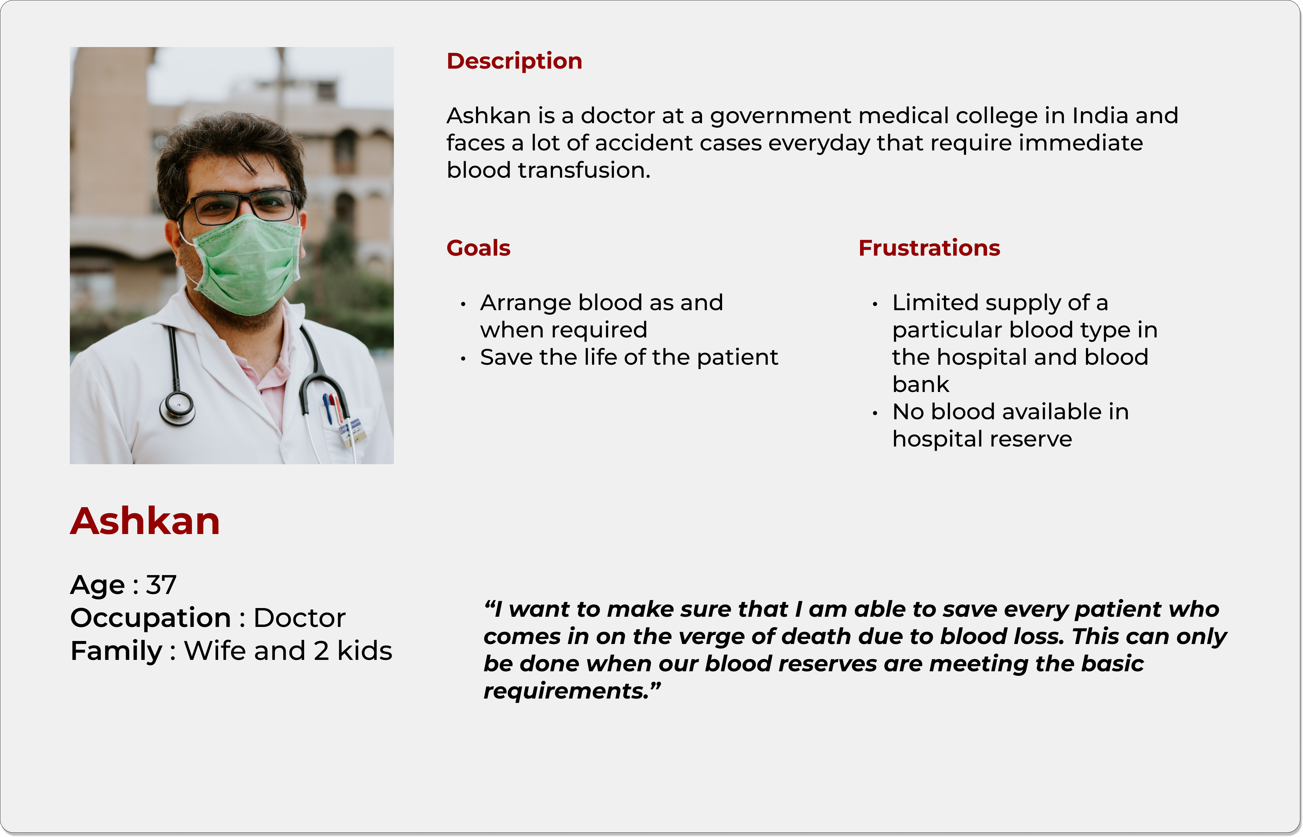
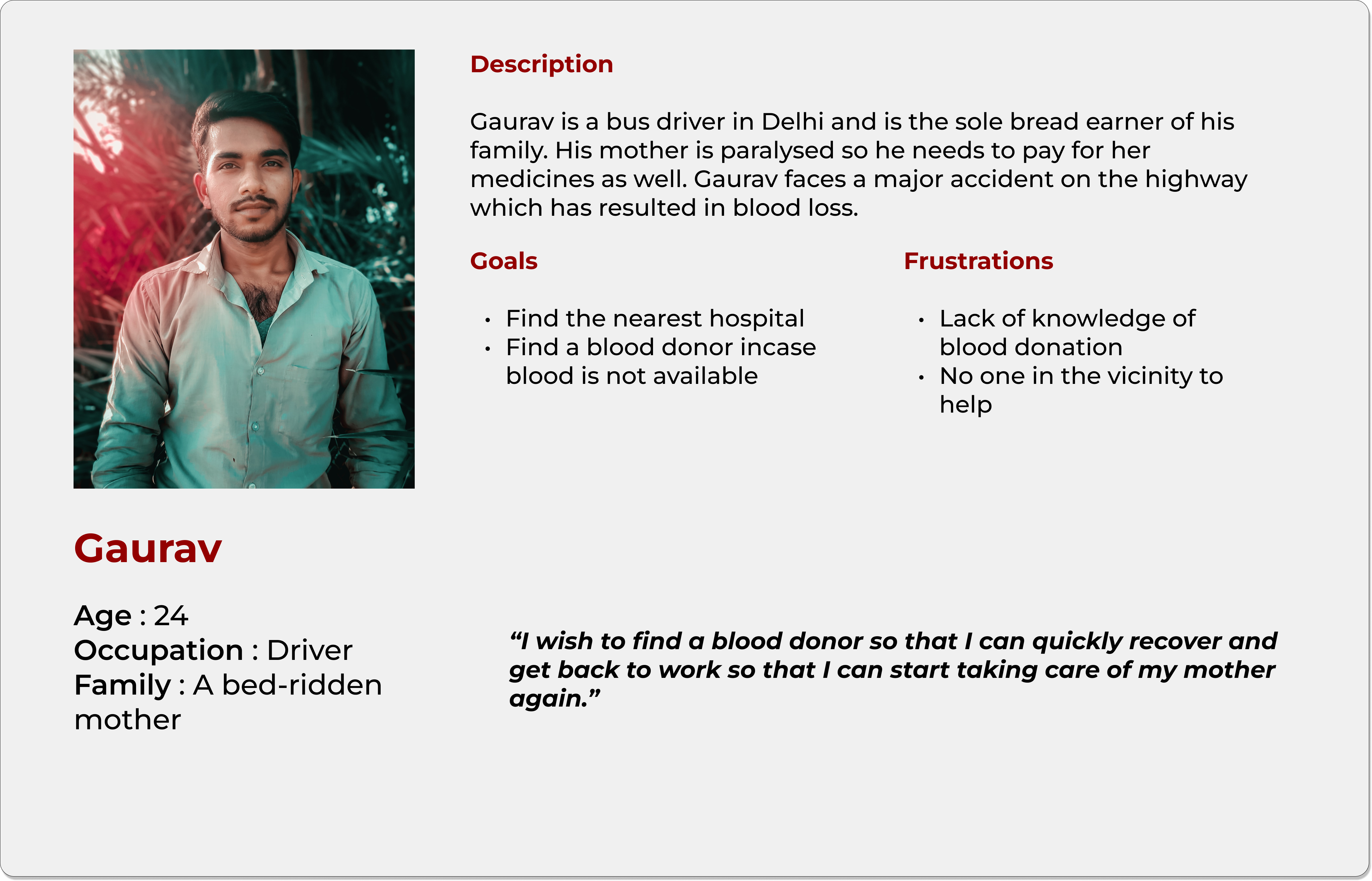
User personas
After compiling all this research onto a miro board and showcasing the findings to the product owners, I started creating different personas that may use the system and the particular user scenarios in which these users may encounter using the system.
Ideation
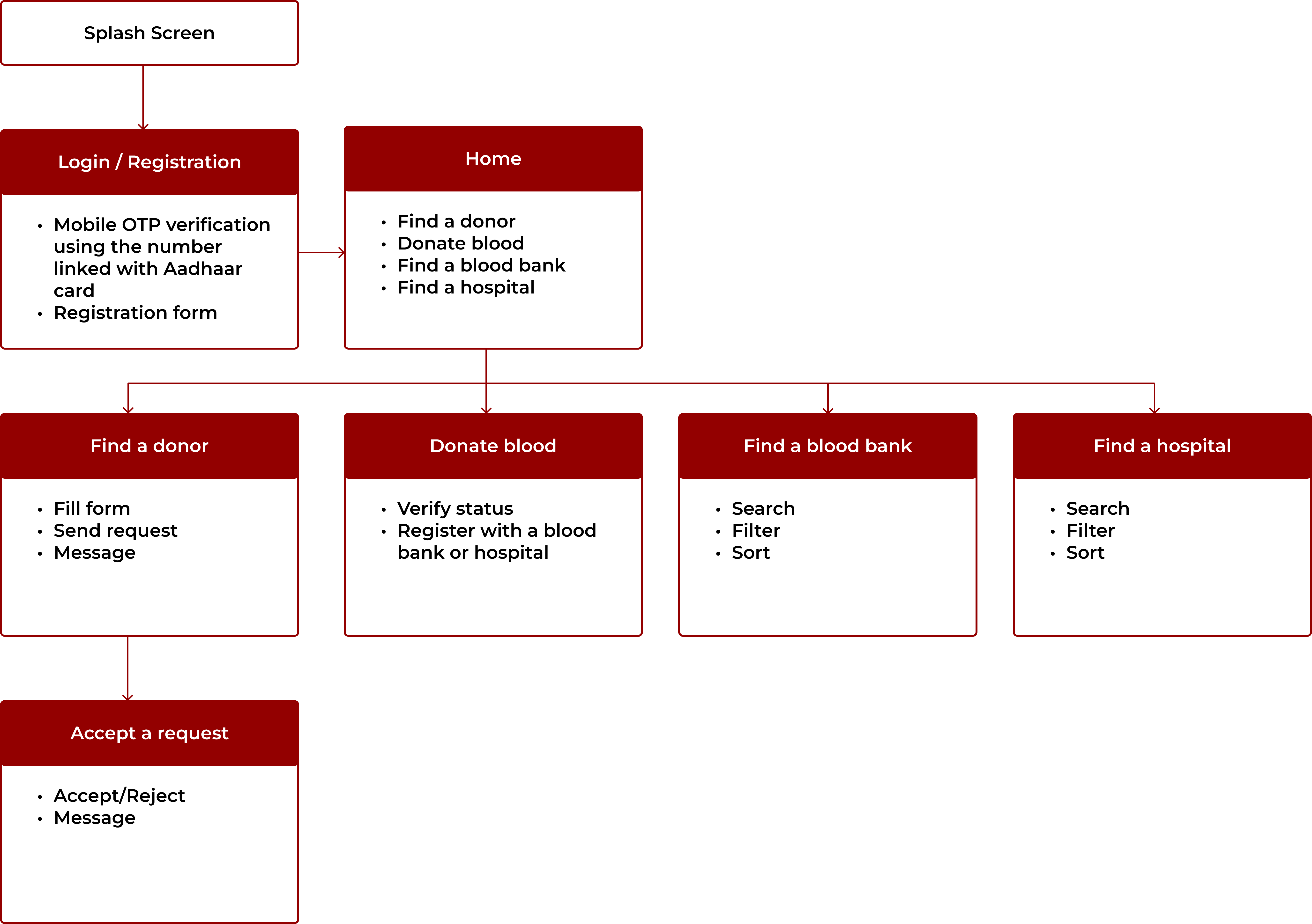
Information architecture
After realizing what solution would bring the most value for my users, I started creating an app navigation diagram on how will the user be able to make requests for blood or even donate blood to a nearby blood bank.
Design
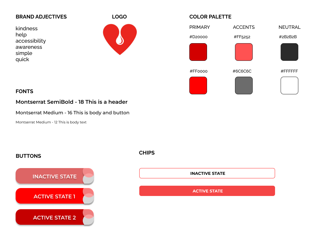
UI Kit
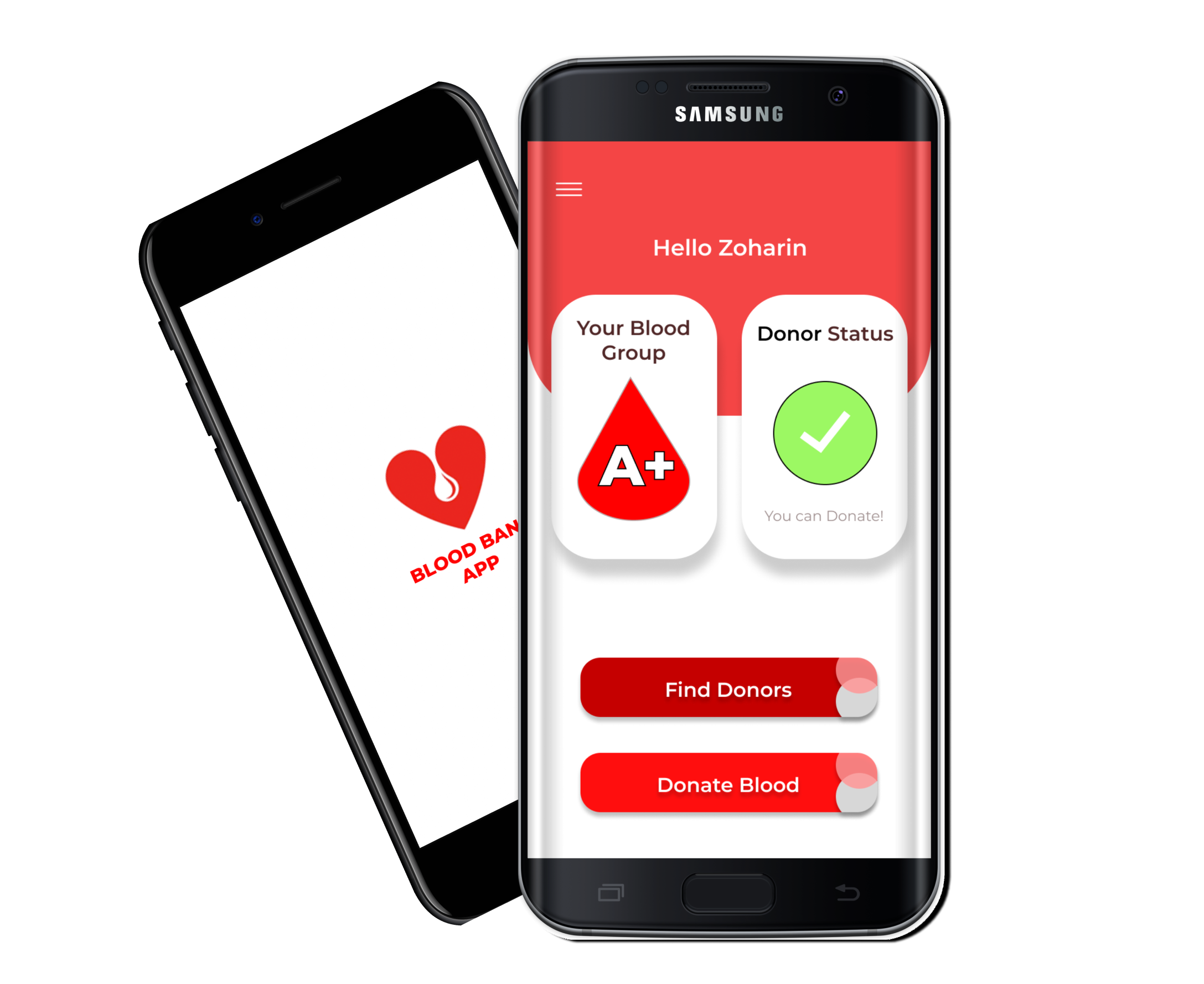
I created the UI kit that reflects BloodLink's brand adjectives, since it helps users get linked to a relevant blood supply or donor.
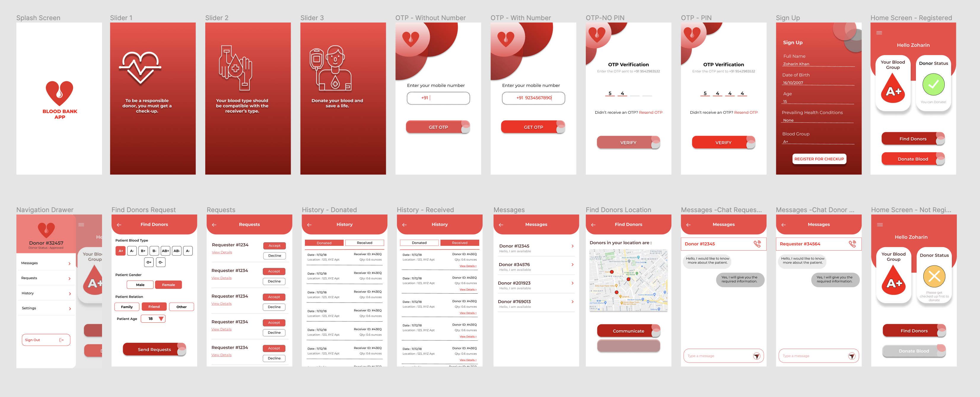
UI
Due to my lack of experience in UX design I had jumped directly into the UI without creating any sketches or wireframes which was difficult to visualize. The entire UI can be found here : Click here!
Evaluation
Usability testing
I tested the first version of the prototype with 5 users to determine the necessary revisions to make the overall experience quick and pleasant. Here are some outtakes.
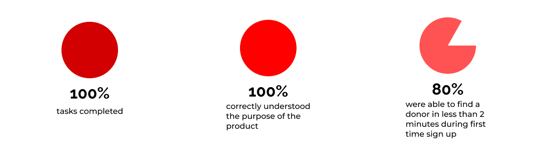
Main points that were discovered during the tests and addressed in the iteration:
- Blood donation comes along with many medical conditions to be analyzed such as non-smoker, above 18 years of age etc so in order to maintain the authenticity of blood donors, the donate blood button on the home screen was disabled and will only be enabled after a medical examination has been conducted of the user, however they can still find donors from the app.
- The registration form was completely changed to including only the name and the Aadhar card number of the individual which is the unique identification of Indian citizens which can fetch all relevant data. This reduced sign up time from 67 seconds to 43 seconds on average when tested with 5 users.
Challenges and learnings
Understanding the subject
Due to my lack of subject knowledge in the field of medicine and lack of availability of medical
professionals, I had to go through a large number of medical records and books to understand what
conditions are required if a person wishes to donate blood and based on that create the structure of the
database in the backend. I had to learn compatibility of different blood types to ensure a person
requesting for blood is able to find only compatible donors because most users may not be aware of blood
compatibility issues which may be fatal for the recipient.
Learnings: It taught me the value of medicine and healthcare professionals and how crucial
subject knowledge is in order to ensure the right experience for the user. It introduced me to incorporating Empathy in my design.
Lack of public awareness
As mentioned above, India does look at a blood scarcity every year and unfortunately the gap is only widening. For this reason, it was difficult to find people who had used these systems before and had registered their information on the systems because a lot of the data had become outdated. Hence, linking the database with the Aadhar system will ensure that all fields are up to date.
Scaling
Once the app was launched to the public it was hard to keep up with the medical examinations of people who wished to become donors. The scaling part of this project was not well thought out since I was working alone and I put in a fair amount of time on the product rather than the actual growth of the product.
Learnings: It is important to make sure the product and experience can pass the test of time.
Conclusion
This was a very hectic end-to-end project since I was working solo from inception to launch without much
feedback and guidance. My lack of awareness of design thinking can be seen through the project gaps such as
not testing the current systems with actual users and not creating any sketches and jumping straight into the
UI aspect and not properly testing it before launch which meant a lot of crashes and bug fixes.
Overall the app is doing what is supposed to do with further improvements and changes since it has now been
handed over to an entire software development team who keep track of the bugs and issues. Journey wise, the
app remains mostly the same which is a good sign that people are not having complaints with it.